
From the 1930s until the 1980s, many pilots got their weather briefings from a meteorologist at a flight service station or airline dispatch counter. The counter often ended up being a center of discussion about the World Series and chatting with other pilots who arrived for their briefing. Those in-person briefings gave way to weather briefings by phone, which have subsequently been replaced by self-briefings using one of a few authorized web sites. Nonetheless, these are all considered a “formal weather briefing” and they make up the backbone of your flight plan.
But there’s long been the informal self-briefing. It’s an unstructured look at the weather, often to figure out an itinerary or round out little details about destination weather. Early broadcast television, which brought radar and satellite to the masses, was a big part of the informal weather picture. From 1978 to 1995 there was AM Weather on PBS with its aviation weather segment, and of course The Weather Channel.
In the 1980s, personal computers arrived and revolutionized flight planning. A pilot could log into AccuData, CompuServe, or WSI and pull up TAFs, METARs, winds aloft tables, and even text-based radar maps. I was part of this trend myself, with my 1993 WeatherGraphix program bringing colorful, high-resolution weather maps to the desktop. Even American Airlines’ operations center in Fort Worth used it for a while.
The Internet brought yet another advance in the late 1990s. This was marked by exponential growth in the amount of weather data, much more sophisticated graphics, and phenomenal expansion of tools for using radar, satellite, and model data. This growth continues to this day. In the old days, forecasters never had enough data and had to improvise. But nowadays, there is far too much data. The forecasters of today have to be skilled at sifting through it all, identifying the information that’s needed and discarding what’s not.
Interestingly a little-known advance has allowed computers to accomplish something similar. This is the process of data assimilation. Put simply, it’s the process of synthesizing the torrent of information on the state of the atmosphere: METAR observations, radar measurements, radiosonde reports, satellite measurements, and much more.
This is funneled into a highly complex multivariate statistical algorithm, often managed by a whole department at facilities like National Centers for Environmental Prediction (NCEP). These algorithms are amazingly good at fitting the data to the most likely state of the atmosphere and discarding what doesn’t fit. The systems are known as 3DVAR and 4DVAR, and today’s forecast models literally could not run without them since the models require all the input arrays to be properly tuned and balanced.
Models
And that brings us to one of the great advances of the 21st century: accurate, dependable weather forecast models. Weather models weren’t always accurate. In the 1960s they were regarded as a curiosity with great potential, and in the 1970s and 1980s they had to be used carefully alongside observed data. Some forecasters in the 1980s derisively called the new NGM the “No Good Model.” The late Harold Taft, a famous Dallas TV weatherman from the 1950s to the 1980s, described the NGM’s fine-scale grids as looking at an elephant with a microscope.
However, the 1980s and 1990s brought enormous advances to modeling, and it would have not been possible without the new data assimilation schemes we just described. These helped make sure that all model runs were off to a good start and were working with a realistic set of numbers.
Those of you who are gamers know how much faster computers are now, compared to the “good old days.” The increase has been exponential. In years past, computers were too slow to run models and it could take hours to generate a forecast. Now a computer can generate a complete forecast in just a few minutes. This led model developers to create ensemble forecasts, where the same model is run perhaps 100 times, each with slightly different states. This has led to probabilistic forecasting, which is currently at the cutting edge of meteorology and helps forecasters get an idea of model certainty and the possible range of outcomes.
We won’t cover ensemble forecasting in this article, but instead we’ll focus on the deterministic model forecast, which is the typical model chart you find on the Internet. It’s made with a very high-resolution run using the best available data assimilation array. It’s good enough for most purposes.
It’s also important to be aware of the many different model types. We can divide them into global models, which cover the entire planet, and regional models, which cover a continental or national region of interest. Sometimes a regional model is a subset of the global model, and this is done by the UK Met Office (UKMET model) and Environment Canada (GDPS/RDPS model).
At the official modeling center of the United States, NCEP, the global and regional models are different systems. The global model is the GFS, the Global Forecast System, which is an outgrowth of the old AVN and MRF models that old-timer pilots might recognize from decades ago. It’s a close competitor to the European model known as IFS (Integrated Forecast System) but traditionally known as the ECMWF model. Some readers may remember when they were compared extensively in the news following Hurricane Sandy in 2012. The regional model is the NAM, the North American Model, which uses a unified model package known as the WRF, or Weather Research and Forecasting model.
Advances in small-scale forecasting have led to much higher resolution models. These are known as convection allowing models (CAMs) because the forecast grids are fine enough to capture cumulonimbus towers, outflow boundaries, and other forms of convective-driven weather. The equations can handle them explicitly. The High Resolution Rapid Refresh (HRRR) is the best example of a CAM, and is very useful for aviation weather planning. Not all CAMs in current use are global models, and because of this they should never be used more than about 24 to 36 hours in the future.
So by now, you might be getting an idea which models are useful. In the United States the HRRR is the best model to use out to 24 hours. The NAM is best for 6 to 48 hours in the future. And the GFS is best for 12 to 144 hours in the future (beyond that, accuracy falls). I have not found the NAM to be particularly accurate, so often I will just use the GFS for anything beyond 12 to 24 hours. If you use models regularly, you too will find your favorites.
Where can you see model data? My favorite sources are Pivotal Weather, which provides large, clean model charts, WeatherNerds.org, and the Tropical Tidbits model viewer. You can find these easily by typing them into your favorite Internet search engine. For HRRR data you can also visit the NOAA Global Systems Laboratory (GSL) website at rapidrefresh.noaa.gov/hrrr/HRRR/ to see a rather exhaustive set of maps.
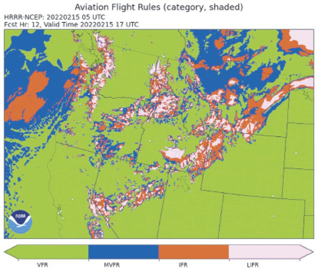
The GSL site offers HRRR forecasts of aviation flight rules, maximum wind gust, cloud cover at different layers, visibility, and ceiling, so it’s certainly worth a look. Be sure to use the “Domain” dropdown menu at the top to focus on your part of the country. There are many other sites on the Internet where you can view model data, but these are my preferred choices.
Buyer Beware
Although I have sung the praises of today’s models, I should point out that they still have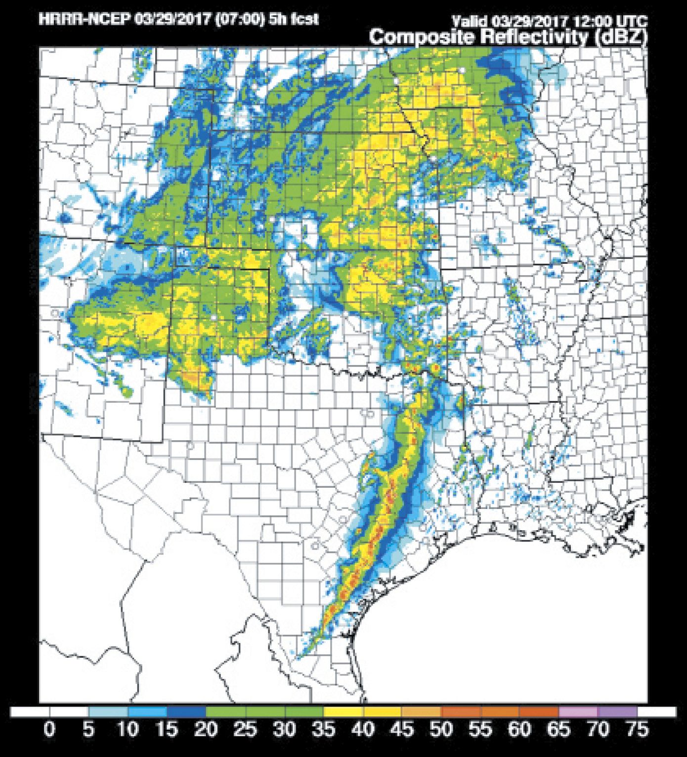 their problems. At the large scale, they are highly accurate. If you’re flying a Triple-7 from New York to London, the winds that are forecast will very closely approximate what you see from the flight management system.
If you’re flying from Denver to Fort Collins, just 40 miles away, things get a little more problematic, especially if there’s active weather like downslope winds. The GFS global model is coarse and will just approximate weather along the entire route. So most likely you’ll turn to the HRRR model.
In many cases the HRRR does a good job showing the general wind field along the route. But there’s just not enough granularity in the available observed data to accurately model all the small changes along the route. The HRRR will have the right idea, but you should not be surprised by variations in the wind field. In most cases the model is doing a great job, but simply doesn’t have enough data to know how much outflow is falling out of a storm or what the exact winds are in the foothills.
The greatest strength of a model is in the initial forecast hours. The accuracy will gradually diminish over time. When you see a wind shift halfway between Denver and Fort Collins on the two-hour forecast, there’s a reasonably good chance that you will find that feature somewhere around there in two hours. When you see the same thing on the 14-hour forecast, you should factor in the possibility of a large positional error or even no wind shift at all, since that’s quite far into the future for the HRRR model.
The GFS model, though it’s very accurate in the short term, will not resolve this same feature very well due to the coarseness of its forecast grid. But if it’s embedded in a larger scale system (like the wind shift being part of a cold front), you can expect that there will be good consistency in the handling of this feature for a few days, possibly out to 72 hours or longer.
Finally you need to be aware of geographical constraints on models. The maximum resolution on the HRRR model is three km, which means that the fractal nature of mountains with their many canyons, ridges, hollows, and so on, and their influence on wind and weather cannot always be modeled accurately. The GFS, by contrast, has an even coarser resolution of 27 km. So if you are in a mountainous area, limited model resolution will be a possible source of errors. Always look at the big picture.
If you’re at Burbank Airport, for example, you’ll want to look at what the entire Los Angeles basin is doing. If the model is expecting stratus as the marine layer surges inland, there’s a good chance Burbank will be involved too unless the model shows that the Santa Monica Mountains and Hollywood Hills appear to be blocking the air mass.
Using the Models
There’s a temptation to just dive in with the products you need, like a forecast map of cloud cover, precipitation, or ceiling. These are called derived products, and since they’re the result of a calculation on multiple variables, you’re less likely to get an accurate result. The forecast models only work in terms of basic physical properties: pressure, temperature, humidity, and wind vectors. These derived fields work with an assumption that those basic fields are correct, and only then can the algorithm make an attempt at an accurate forecast. This makes the numbers somewhat codependent and prone to failure.
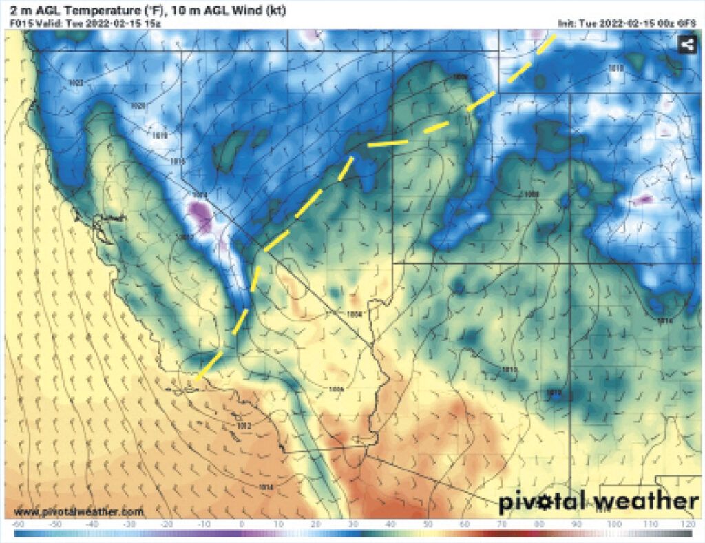
Because of this I always start with the basic fields. A plot showing wind barbs and temperatures across a region is a great place to begin. This will show you what wind regimes are covering an area, where boundaries and storms might be lurking, and where fronts and wind shifts are located. If you’re looking farther in the future, such as with GFS output, sea level pressure and temperature work better.
With these basic fields, all of the principles you’ve learned in past WX SMARTS articles apply. It’s basic meteorology. Gradients with strong temperature contrasts, not caused by mountain ranges or coastlines, mark the location of weather fronts. These are usually marked by wind shifts and pressure troughs.
Once I have an idea of the big picture, precipitation and radar reflectivity products are some of my favorite images to look at. The GFS model will not resolve individual storm cells, but will draw rough representations where they’re breaking out and persisting. Convection allowing models like the HRRR will create the individual storm cells and try to model their behavior. Remember since the resolution is only three km you should not be scrutinizing these cells too closely, but there’s great information from seeing whether they form into lines, group into clusters, or remain isolated. Severe supercell storms show a somewhat distinct triangular shape, cluing you into tornado and hail potential.
And remember that the position can vary, so it might help to look at how the model is performing so far, and see if actual cells are already outrunning the forecast position. I’ve found that this does tend to happen sometimes in squall lines, so it may be necessary to adjust the forecast position of storms further east than expected.
Finally, I want to caution you against using some of the popular sites that present pretty, animated pictures of the wind or simplified presentations of model data. They exhibit problems like oversmoothing of the fields, no clear information on the displayed forecast hour, and vague product names like simply “radar” instead of “composite reflectivity.” Model sites should always be crystal clear on all of these details before you begin using them in any decision-making process.
The websites I mentioned earlier are free of such problems and present the original data straight from the weather agencies. Enjoy!


