
Jeppesen is updating symbology for STARs and SIDs charts. As part of the change, Jepp contracted with an outside firm to conduct an operational risk analysis. “After an in-depth evaluation of the mitigation possibilities TRS recommended to Jeppesen to create a training tutorial.”
Is the answer to all chart risks training? Is the training received sufficient? Does the rote memorization of esoteric symbology keep you safe? Are examiners asking the right questions of instrument and ATP applicants when validating knowledge?
Or, are chart errors or omissions leading to accidents? David Abney argued in a somewhat datedJournal of Air Law and Commerce, “One of the most insidious dangers facing air travelers is an inaccurate aeronautical chart… All too often, the maps and charts which should have guaranteed safety have instead engendered tragedy.” (Liability for Defective Aeronautical Charts, 1986)
Charting errors aren’t black swan events. They are fairly common and sometimes only identified by end users in a plane or sitting at a scope. Are bad charts or bad pilots the biggest threat?
Charting Errors
Charts are like parents; when we are young we view our parents as perfect, but as we grow the flaws begin to show. Entities involved in procedure and chart creation require robust quality control procedures and generally do a good job. But, with a massive amount of data and never-ending changes, errors can slip through. The FAA produced 19,468 charts excluding airways and alternate minimums, and amended or created over 3000 procedures in fiscal year 2017.
I’ve personally noticed some errors within the last year. One impaired the FAA’s chart of the PARQR3 arrival into KCLT. On the plan view, the constraint at NCOMA intersection showed 12000-11000 while the textual description instructed to “cross NCOMA between 10000 and 11000.” That’s the difference between a potential mid-air collision and normal separation.
Something similar occurred on a bevy of departures from DFW. The ARDIA6, for example, shows 10,000 as the top altitude on the profile view for all runways, while the route description has pilots maintain 5000 when departing 31L/R.
Once identified, these problems are typically NOTAMed until fixed. NOTAMs possess their own issues, of course, and make it difficult to find the correction while increasing pilot workload.
As you’d expect, the numbers of errors pilots make interpreting and understanding charts may far outweigh instances of bad info. In the court cases that David Abney reviewed, many of the accidents occurred when a flight was already off course or below minimum altitudes.
A 2017 paper by Stewart, Laraway, Jordan, and Freary in theJournal of Cognitive Engineering and Decision Makingfound an average of 1.39 errors per five approaches when all equipment was operative (“Simplified Approach Charts Improved Data Retrieval Performance”). When pilots had to modify minimums due to inoperative equipment, the researchers recorded a staggering 7.28 errors on average for five approaches.
How Pilots Use Charts
Chart producers and scientists share interests in streamlining the transfer of information from chart to pilot. Research into instrument charts is irregular, often clustering around a single focus. There was a flurry in the early 90s examining bolding, boxing and reverse contrast; followed by another in the mid-90s with the development of the briefing strip, and the current renaissance examining RNAV/RNP. Understanding how pilots use charts can bring clarity to the risks associated with them.
Scientists found that pilots group chart info into 10 categories; communications, geography, validation, obstruction, navigation, missed approach, final items, other runways, visibility requirements, and navigation aids.
Each category can contain multiple pieces of information and repetitions of the same info. For example, the approach lighting system is shown in a box at the top of the chart and on the airport diagram. Importantly, pilots typically stay within a category when searching out a new piece of info. For example, a pilot might look at the MSA then the highest terrain and obstacles surrounding the final approach course in the plan view. This demonstrates how pilots mentally process approach chart information. NASA suggested that the approach chart designers organize the information’s presentation by using similar categories.
A finding, likely common between single- and multi-pilot crews, is the importance of preparing for an approach. NASA found that 60 percent of the information acquired from an approach chart occurred during the pre-approach phase (NASA Technical Paper 3561). This phase was defined as an untimed period before the time-constrained approach began.
The usefulness of pre-approach preparation was confirmed by Stewart, et al. They designed an experiment where there was little to no pre-approach preparation time. The researchers found, “there were times when the flying tasks would take priority over the intricate steps of the chart. This caused the chart to be revisited multiple times, eventually leading to some very complicated retrieval errors.”
While the majority of information acquisition occurs during pre-approach, the specific information a pilot references changes by phase. During the final approach segment pilots reference minimums and the missed approach. The conclusion is that a pilot does a complete review then looks a step or two ahead to manage workload.
Speed and Accuracy
Scientists judge chart design by two metrics; speed and accuracy. How fast can info be found and interpreted? Is the info gleaned correct? The underlying theory is that both factors impact safety. With high workload in the terminal environment a pilot doesn’t have time to search around for info or get it wrong.
Surprisingly, most research determined that chart design had little effect on accuracy, only speed. For example, when the FAA was testing the briefing strip format, they found “pilots were as accurate in answering questions using the prototype [briefing strip] format as they were with the more familiar NOS format.” (DOT-VNTSC-FAA-95-13) Recent research into RNAV/RNP procedures found there were no significant differences in accuracy based on chart design, although there was a significant improvement on speed.
This conclusion fails the common-sense test. Pilots are adept at focusing and task prioritization. But, as task loading increases beyond a pilot’s capability, errors are inevitably going to occur. In most of these studies it’s unlikely the pilots were task saturated—likely from studying airline environs with two pilots and sophisticated autopilots.
Steward, et al. noted an additional threat on FAA charts: “if users are exposed to both government and Jeppesen formats, there is a possibility of negative transfer with respect to the meaning of parentheses. This unexpected result may indicate that the lack of unit labeling and selection error possibilities are problematic.” If you’re going to jump between charts as many do, make sure you know what the unlabeled numbers are referring to (AGL, MSL, SM, RVR, etc.)
Actual Errors
Beyond the research, it’s useful to see what errors associated with charts pilots actually confess in ASRS reports. As expected, most are simple misreading.
The intermediate segment before the final approach fix is a hot spot. One pilot never successfully completed any of multiple approaches after he “misread the chart and did not realize that I should have been descending to 1300′ before glideslope intercept.” (ACN: 1458653) He reflected that the “stress of hand flying in IMC caused me to misread the chart and remain too high to intercept on the next two approaches.”
Another pilot “misread [the] approach chart and saw alt from IF to FAF as 2000 ft. rather than charted 2400 ft. Approaching FAF tower informed me I was indicating 2000 ft. rather than 2400 ft.” (ACN: 1452717) The scary addition to this report was that the pilot ignored his equipment’s low-altitude warning, which he “assumed … was in error.” Ruminating about the experience, the pilot realized he was overly complacent at a familiar airport and shouldn’t ignore an altitude warning.
Maybe it’s an innate sense of self-preservation, but reports of misreading minimums are absent. It could be that mins are so important the pilots make sure to get them right. But I’ve witnessed pilots using wrong mins, either due to a simple misreading or misinterpreting the ones to use. Pilots may be using the wrong bottom altitude and not even realizing, explaining the lack of ASRS reports.
Pacifying Charts
A couple steps can keep a chart from becoming a problem—highlighting the final approach fix altitude, knowing the meaning of numbers, practicing math, and buying time.
Using the wrong altitude for the final approach fix appears often in ASRS reports, likely because a pilot fixates on the final segment. Highlighting, circling, or anything else that brings attention to the final approach fix altitude will help mitigate this error.
Knowing each number on a chart is just rote memory. But, switching between chart providers can cause confusion when similar symbology has different meaning. For example, the meaning of parenthesis differs between Jepp (decision height) and government charts (military minimums).
Adjusting for remote altimeter settings and inoperative equipment conjures memories of high school word problems. (Two trains leave a station…). Fortunately, we get better with practice. Find approach charts with the biggest notes section and try to decipher them.
While sitting on the couch, even the most complicated chart can seem straightforward. The task loading and saturation while flying increases the challenge. Stewart, et al. noted that “no participants asked for a delay to prepare for the approach” and “at no time was it said that delays were not allowed.” This jives with findings in the crew environment where the pilot flying relied on the pilot monitoring. Single-pilot, you have both jobs and must take time to digest complicated chart notes.
Charts are tools. Correctly used they provide reliable and consistent results, but occasional errors can lead us astray. Checking NOTAMs and maintaining situational awareness is the best mechanism to catch these errors. Many errors don’t come from the charts themselves, but from interpretation. Although much effort has gone into understanding how pilots use charts and improving the design, charts are still just small depictions with a lot of information. Knowledge is required to translate the charts to an accurate mental model. Maybe it comes down to training; maybe not.
Training and Checking
Instructors should be teaching, and examiners should be checking, two items about charts—the meaning of numbers and application of the various adjustments.
Even seemingly simple minimum lines require close examination. For example, when RVR is published on government charts the equivalent visibility is omitted. But how many just look over and see a visibility value listed in parenthesis? You know, the portion of the chart that applies specifically to military minimums.
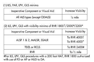
Determining approach minimums can get complicated, taking up to 10 steps with inoperative components or remote altimeter settings. When the approach chart lacks specific notes, the inoperative table in the front of the chart book is used to make adjustments for inoperative equipment. The chart determines the amount of visibility to add based on the inoperative component.
At Dallas Love Field with the MALSR approach lighting system (ALS) inop, for example, there are no chart notes discussing inoperative equipment so we use the inoperative table. Note the visibility increases and use the highest if multiple adjustments apply. In this case the chart says to add mile in table one and increase RVR to 4000 in table two. Table two requires reference to the original minimums, 1800, to determine the adjustment. A quarter-mile is about 1600 RVR. Adding that to the charted minimums of 1800 results in 3400, which is less than 4000, so our new minimums are 4000 RVR.
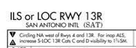
The San Antonio ILS 13R further increases the complexity. Non-standard adjustments for certain categories are identified in the notes, “for inop ALS, increase S-LOC 13R Cats C and D visibility to 1 3/4SM.” This only applies to Cat C and D on the LOC; for all others the inoperative equipment table applies.
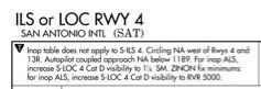
A more interesting, and confusing, note resides on the SAT ILS 4 charts. It declares that the inop table does not apply for the straight-in ILS, then discusses circling before returning to non-standard adjustments for the straight in localizer approach.
The pinnacle of bewilderment occurs when adjustments for the use of a remote altimeter setting and non-standard inop equipment combine, as for my home airport of McKinney (KTKI). Mapping the human genome feels easier than determining mins.
Jeppesen charts provide separate mins for the different inoperative equipment combinations. But, even these can get overwhelming. San Antonio’s ILS 13R lists 11 different minimums just for Cat C/D.—JM
Jordan Miller, ATP, et al., is a pilot for a major U.S. airline and really geeks out on this academic stuff (and we’re glad he does).


