
Chances are you’ve looked over weather charts, whether at a dispatch office or on the Internet, and wondered how that pile of spaghetti becomes a forecast. Granted, with all the flight planning tools available and 24/7 access to a flight weather briefer, this is not something pilots need to know. Indeed many pilots find themselves too busy to do a deep dive into the weather. But there are many benefits from learning how to take in the “big picture” and understand exactly what the weather is doing. That makes it much easier to put TAFs and other data into proper context, and it takes your situational awareness up a notch.
These days there are countless weather charts available on the Internet. Let’s start with the most reliable, safe source of data: the Aviation Weather Center website. We’ll use the new Beta Charts page at beta.aviationweather.gov that represents the kind of planning charts we will probably see throughout the remainder of the 2020s. If you have your own favorite flight planning website, you can still follow along and look up a similar chart that works for you, as most of these websites are designed around the same key products.
Upper-Level Flow
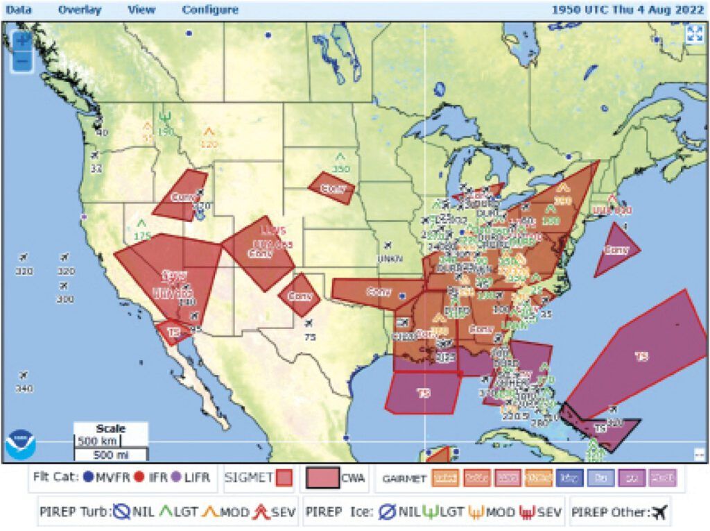
When you drop into the Aviation Weather website, you’ll usually see a plot of SIGMETs and AIRMETs. Those are best for sizing things up later. For now they get in the way. We’ll go to the layers panel at the top right to remove those. We will then select the winds aloft plot. Here’s the key: Choose the 30,000-foot winds on the left-hand slider.
The winds aloft should be your very first stop when taking this kind of detailed look at the weather. The upper levels are influenced heavily by what’s going on below: not just in terms of cloud tops but also in how mass is distributed through the atmosphere. To myself, as a meteorologist, using an upper-level chart is very much like the first step of car repair, where you listen for noises, look for leaks, and check under the hood before breaking out the wrenches and screwdrivers.
On our example chart below we have used the wind plots and the speed field (color shading) to find jet streams and lows and highs. The jet stream is pretty intuitive: the process is just finding major rivers of fast-flowing winds and locating the axis. These rivers are shaded in yellow, orange, and red.
Lows and highs are a little trickier, but it’s important to find them. For this we use two key indicators. First is Buys-Ballot’s Law, which states that when you’re in the Northern Hemisphere with your back to the wind, low pressure is always found on the left and high pressure on the right. This is useful because you can use jet streams as a starting point for finding low and high pressure which I’ve added to the plot.
The other law we follow is that of cyclone rotation. In the Northern Hemisphere, low pressure areas, or cyclones, have flow which rotates counterclockwise. High pressure areas, or anticyclones, rotate clockwise. There are exceptions at the smallest scales where Coriolis force is negligible, such as in tornadoes and mesocyclones, but we don’t see these things on national maps.
And that’s all there is to it! In our example we find a low pressure area off the California coast near Los Angeles where winds are rotating counterclockwise. We also find high pressure areas over New Mexico and the Carolinas, where the wind spins counterclockwise. Less obvious is the low pressure in Canada. Although the data plots don’t extend into Canada, we know there’s low pressure there because of Buys-Ballot’s Law.
Technical discussions will often talk about these features in terms of “height,” short for geopotential height of an isobaric surface. This terminology is interchangeable with pressure. Adding mass bumps up the pressure and raises geopotential height to a higher level, so we can describe this situation as either high pressure or high height.
What This Tells Us
In the upper levels, high pressure aloft is closely tied to the presence of large amounts of warm air in the lower and middle levels. Likewise, low pressure aloft is tied to cold air masses. This is because warm air naturally expands, while cold air does not. Warm air’s volume causes mass to distribute higher into the atmosphere, bumping up isobaric pressure surfaces, and as a result we see high pressure and high heights aloft, especially near the top of the troposphere. The converse is true for cold air.
A safe starting assumption using our winds loft chart is that there’s hot weather in the Four Corners area and in the Carolinas. This was not particularly true for the Southwestern states, but here a strong monsoon pattern was helping to convert the heat over to thunderstorms and rain. In the Eastern states, however, heat advisories were widespread, with heat index readings soaring over 100 degrees.
These principles also hold true for upper ridges and troughs. A ridge is an extension of a high pressure area, such as the one shown extending from Colorado into Nebraska and Minnesota. An upper-level ridge has characteristics of a high pressure area aloft, and often has hot weather. We’ve marked two samples on the map.
Likewise with upper troughs, like the one extending from Illinois to Mississippi, we find qualities of an upper low—cooler than normal conditions, at least in the middle and upper levels if not at the surface. And if conditions are warm at the surface, which is probable as this is August in places like Memphis, this means a “cold over warm” situation, which is the classic definition of instability. Showers and storms can be expected. A quick check of the Memphis TAF showed “VCSH” in the forecast with overcast conditions at night.
Upper troughs are particularly important because rising motion is strongly favored ahead of (downstream from) a trough, along with destabilization and frontal development. A villain commonly talked about in forecasting circles is the “short wave trough” which is linked to bad weather. The trough drawn on Figure 1 is more of a medium-scale trough, but the principles are the same. So the Ohio River Valley is a place where you need to be on guard.
Aviation Weather Essentials
And now we gradually zero in on what this means to you. The zone in between the lows and highs is where we find the boundary between warm air masses and cold air masses, known as the polar front. This is the so-called “battleground of the air masses.” The jet stream is also closely tied to the polar front’s position. Most of the bad weather will be concentrated in this zone.
This is important because many sources of surface maps present fronts in a somewhat disorganized, haphazard manner, and it can be difficult to tell which ones are truly important and which ones are just old stagnant boundaries. The upper-level chart clarifies this better. Significant fronts are located along and equatorward of jet streams wherever the upper-level winds are roughly 50 knots or greater. This is not true of subtropical jets, which often affect the Gulf Coast region and northern Mexico during cold season. Those can often be identified by the much weaker wind below 30,000 feet, often falling below 30 knots, and weather is often VMC below Class A airspace.
Looking at the chart, this should draw your eye immediately to the Northern Rockies, especially around Montana and Washington. This zone implies active fronts with the possibility of broad cloud and precipitation shields, mostly along and north of the jet stream. This clearly spells problems for western Canada. Clear air turbulence is also possible in and around these strong jet streams.
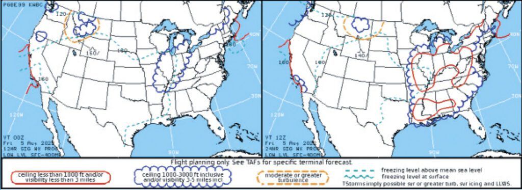
The flight weather hazards chart and the forecast summary, top and bottom on the previous page, show that the majority of problems are closely linked to the area ahead of the upper-level trough. This is definitely the region with the most potential for trouble, with possible convective precipitation and dynamic support from frontal systems and upper-level winds.
SIGMETs cover much of the southwestern states, but as this is within the subtropical high pressure area, much of this is convectively driven with very little upper air support. This indicates a strong diurnal pattern, with the greatest hazards in the afternoon and early evening, and the least trouble around dawn. The small jet stream angling north through Arizona is capable of supporting storms well into the nighttime hours, but this activity too is likely to die off by dawn.
On the forecast summary chart we can see how the aqua-colored freezing level contours closely follow the areal extent of the upper-level high. The highest values of over 16,000 feet, are found within the core of the high pressure area, reflecting the large extent of warm air aloft. The lowest values, below 12,000 feet, are found in Washington in proximity to the upper-level low in western Canada.
Highs and Lows in Depth
What are these highs and low, and where do they come from? As described above, they are reflections of the thermal field throughout the troposphere. But they do have names and behavior.
The large high-pressure areas are normally known as a subtropical ridge or high, and are part of the broad equatorial ridge that rings the tropics. The familiar “Bermuda High” that parks itself in the North Atlantic Ocean—affecting weather in the east coast region— is a prominent example. During the summer these subtropical highs often break off from the equatorial ridge and occupy the middle latitudes, sometimes centered over places like Utah and Illinois. This puts areas to the south under easterly flow, which can bring unexpected weather changes since we’re normally accustomed to systems moving west-to-east.
The low pressure areas are part of the polar vortex. This is not the same “polar vortex” you hear about on the news that causes freak snowstorms. The polar vortex is a very large, permanent low pressure area in the Arctic and Antarctic latitudes caused by the sheer amount of cold air in those areas. When this cold air breaks off and heads south, an upper-level low or a trough usually follows overhead. These are also known as cold-core lows, baroclinic lows, or baroclinic troughs.
As these systems occlude, they evolve into barotropic lows or occlusions and move into places like Quebec, Iceland, and the Aleutians, which are all a sort of dumping ground for these lows. Here they are gradually re-absorbed by the polar vortex, and the cycle of life begins anew.
Sometimes these lows become detached and migrate to temperate or subtropical latitudes, or they develop there. This is common along the U.S. West Coast during the cold season. It leads to a strange situation where a large upper-level low is found well south of the polar front jet. An example of this is seen in our first illustration off the California coast. These have a unique name: “cutoff lows.”
As recently as the 2000s, numerical models had tremendous difficulty with cutoff lows, and as they are most common in the southwestern states, especially in the early spring, this led to a lot of the busted forecasts we would see in the western half of the country. Rapid advances in data assimilation, numerical modeling, and remote sensing have filled in the gaps, computationally speaking, and now the models do a fairly good job handling them.
Fortunately, cutoff lows don’t produce a whole lot of bad weather, limited mostly to high-based showers and gusty convective winds near the surface. They too are absorbed by the polar vortex, usually after “opening up” and taking a track across the Rockies and into the Great Lakes. During this time they sometimes organize short-lived, fast-moving frontal systems on the Great Plains and this may produce precipitation and low cloud as they move across the Central states.
Hopefully now you have a better understanding of what you see when you look at a weather chart. Granted, we’ve just covered one type of chart, but as you’ve seen, there’s a surprising amount of information at hand, and it does a good job helping you to anticipate what you might see on other weather charts. In the next article we’ll cover the surface chart, and show you how to make sense of it and how it can help your flight planning.


