
Monday was spent in Dayton, Ohio at the Air Force Museum—one of the most interesting aviation museums in the world—with a vast selection of nearly 400 military aircraft in several huge hangars. Best of all there’s no admission fee. We lost track of time and we were pushing the clock to get to Dubuque, Iowa that evening. Dave is with us again and he got a tip that the Best Buy there still has a few Sony PlayStation 4 units in stock. He doesn’t realize avgas is over $6 per gallon, but you want the hours and there’s probably a good local steakhouse to try. We agree, “OK. Sounds good.”
We return the rental car and head into the FBO. I pull out my laptop. The maps immediately show a powerful Alberta clipper marching southeastward toward Iowa. The TAF for our arrival reads “34012KT 1 1/2SM -SN BR SCT008 OVC015.” The ceilings aren’t too bad, but the visibility definitely puts us into IMC territory. Since it’s January, icing is a big concern. No SIGMETs are in effect but there’s an AIRMET with icing up to 11,000 feet along our route. This puts us a little on edge and it’s when tools like our XM Weather datalink really pay off.
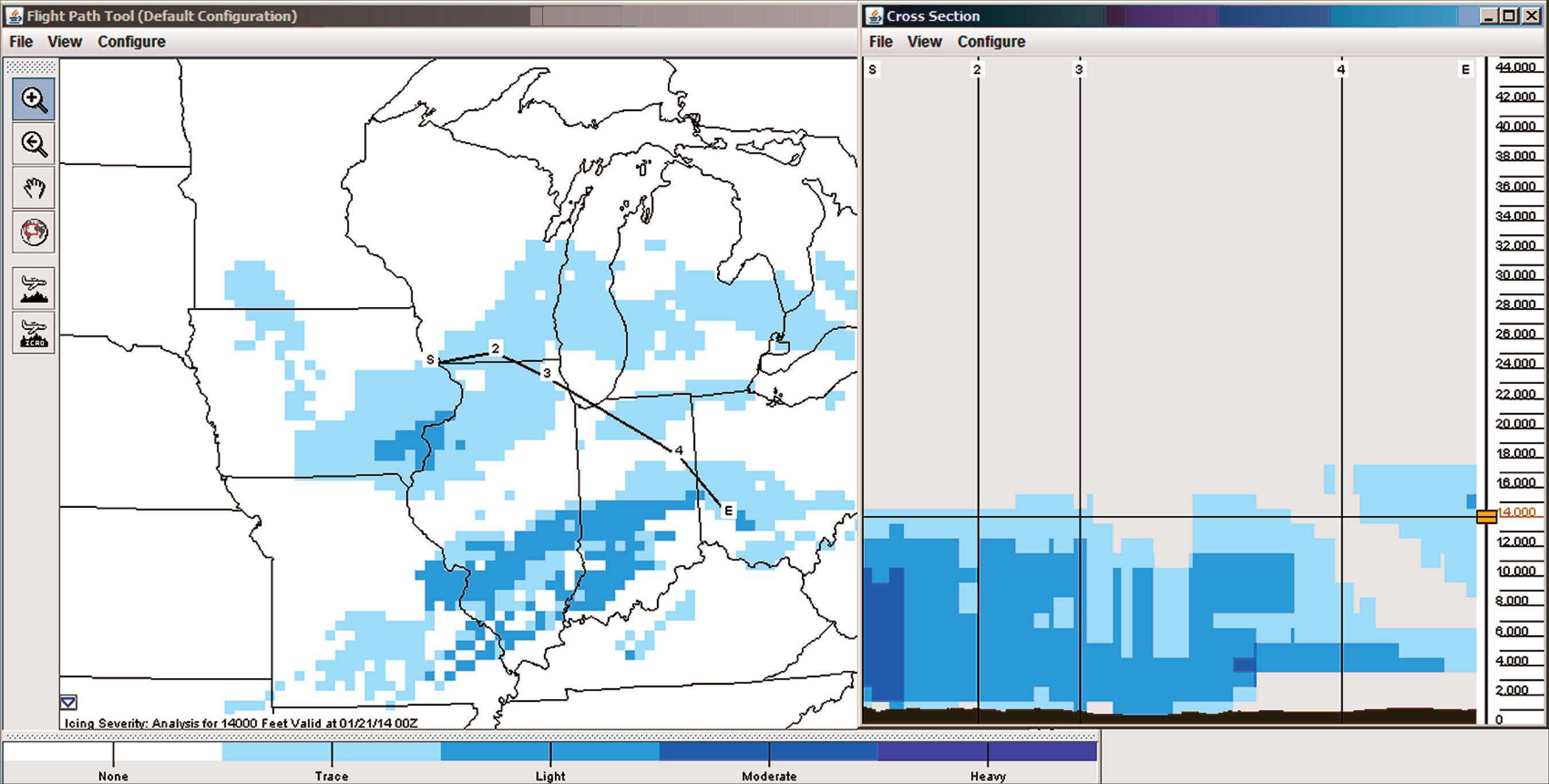
To get a better perspective on things, we start with the Aviation Weather Center’s Flight Path Tool at aviationweather.gov. This helps give us a three-dimensional picture of weather hazards along the way (Figure 1). Scrolling to our arrival time we see that flying at 14,000 feet will put us just above the worst icing, but things could get a little dicey on descent. The tool also shows us that the low-level icing will remain primarily confined to Iowa and Illinois. Wisconsin looks good for an alternate. We could probably find a good steakhouse there, too, but probably not a new PlayStation for Dave.
After working out our flight plan over Fort Wayne and Chicago, we head out to our Mooney, do the preflight, get our IFR clearance and in less than 15 minutes we’re rolling down the runway. As we climb into the overcast stratocumulus, we muse that 20 years ago we’d have been more concerned about the weather, trying to get info over the radio from FSS. But with our datalink weather we get all the information with graphics for everything from radar to flight level winds and icing forecasts.
What’s Out There
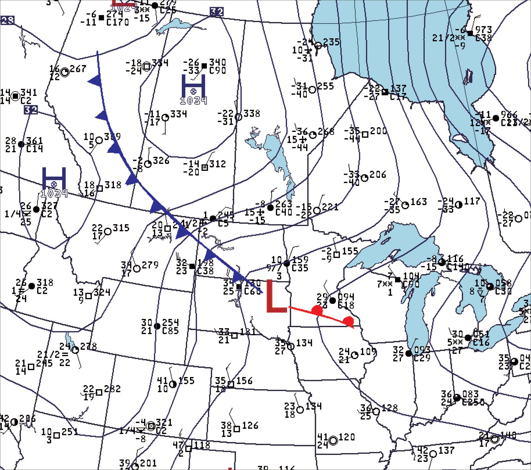
So what’s causing the icing? To answer we need to go beyond the charts and actually visualize things. We’re dealing with an Alberta clipper hurtling southeast from Canada. Clippers are winter systems that occur when the jet stream extends from the Canadian Rockies southeastward into the United States. The jet stream induces a lee-side trough to form in and around Alberta. Pacific systems embedded in the flow intensify after crossing the Rockies and entering the trough, then they move southeast with the prevailing flow. Cold air spills south rather easily this time of year, so the clippers mark the leading edge of these incursions (Figure 2).
When we think of bad winter flying, we think of warm fronts. Lots of low ceilings, fog, freezing rain, sleet, and a smorgasbord of icing. These cause the bulk of diversions, and for the less fortunate, most of the weather-related NTSB reports. The lift with warm front situations comes from so-called overrunning of warm air over cold, referred to by forecasters as isentropic lift, along with the infusion of rich moisture flooding in from the south.
A clipper is different because the warm front is usually poorly developed and while it does cause some weather, it’s rather localized. Instead, the bulk of the lift is concentrated in a cold conveyor belt or wraparound zone northwest of the low pressure area. The bad weather is caused by frontogenetic forcing and convergence. These are complex topics, but you can easily look for something that gives them a boost: pressure falls. So if you happen to notice the altimeter settings at the center of the system dropping rapidly, you can expect a direct response in terms of ceilings and icing. Another thing you can look for is instability. If temperatures fall rapidly with height or you see a closed low aloft on the maps over the weather action, it’s a good indicator that the clouds and precipitation will organize into bands parallel to the low-level wind, with relatively heavy, showery precipitation in the bands and breaks in the bad weather between.
Fortunately, icing layers are shallow in clippers because there’s little warm, moist air just above the surface. Temperatures fall rapidly with height, so the -20 degrees C level that tops most icing zones is found relatively close to the ground, perhaps at 5000 feet instead of 20,000 feet. Also the air infiltrating the cold conveyor belt comes from the polar regions and is sometimes quite dry, in which case the wraparound clouds and icing will be confined mostly to a height of 5000 to 10,000 feet while airfields on the ground enjoy VMC with good visibility.
Some of you may remember from ground school that if conditions are unstable, visibility will be good. The cold air flooding in behind a clipper passes over relatively warm ground, causing it to modify. Cold-over-warm means an unstable air mass, and by warming the air mass from below, we are increasing the instability. So there is a tendency for there to be good visibility and gusty winds in the wake of a clipper, but visibility and ceilings will still be degraded in parts of the wraparound where lift and humidity are combining forces.
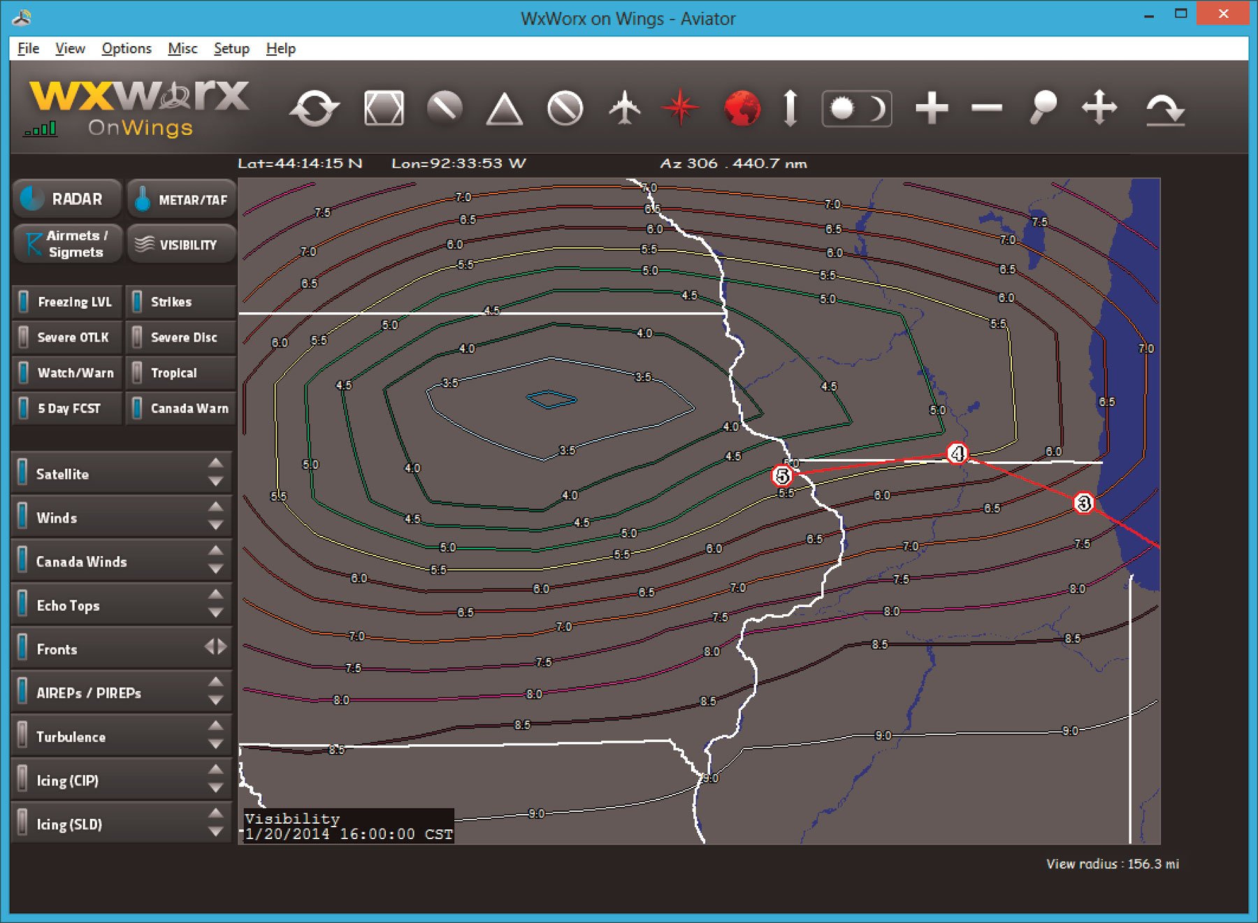
We look at the visibility product (Figure 3) to identify areas of poor visibility. This graphic is created by extracting the prevailing visibility from all of the observations, mapping them to a grid, and drawing isopleths. The downside is that mathematical noise must be removed to prevent illegible, jagged lines, and this is done by smoothing. Our chart appears to show excessive smoothing. For instance, the actual reported visibility at Dubuque at this time was 1 3/4 mile, while the product here suggests 5 miles. The true value of this product is to quickly identify the center of the area and its extent. When exact values are needed, go straight to the METAR report product.
Watching It Play Out
The flight is routine as we remain between layers, watching daylight fade. In the darkness over Chicago we can see the golden glow of the city from below. Reaching Janesville we’re only about 30 minutes out.
“Time to see if cheddar is on the menu tonight,” I say. “Can you bring up the observations?”
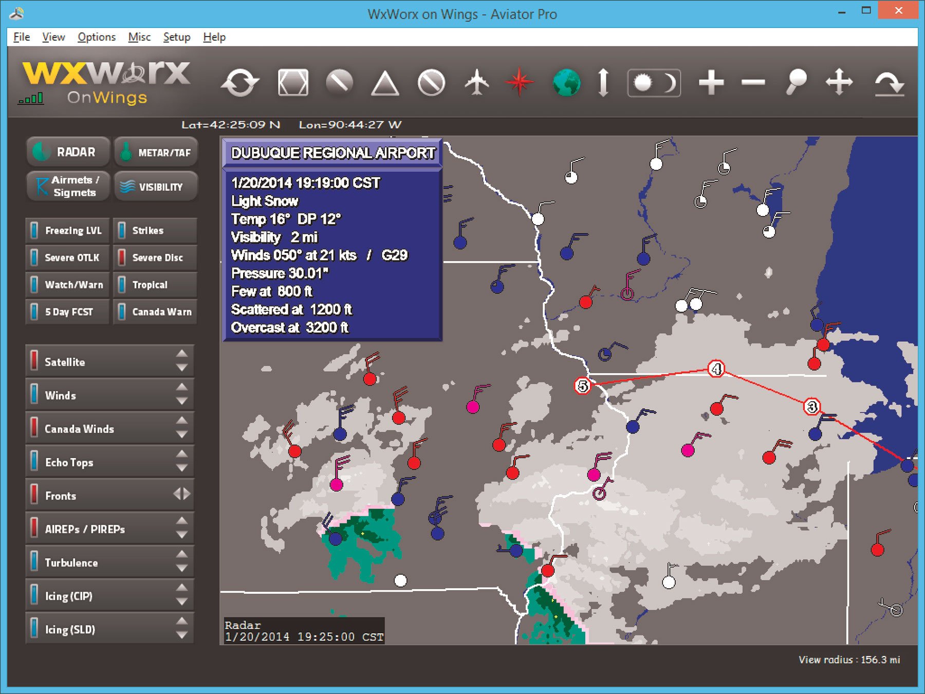
You click on the Radar and METAR buttons (Figure 4) and we take a look at Dubuque. The important things to remember on the radar graphic are that it is a composite reflectivity depiction, showing conditions at all flight levels, and the solid-mixed-liquid coloring refers to the observed conditions at the surface, not at altitude. So this product should not be used to infer icing but to evaluate what kind of precipitation might be occurring at, or near, the ground.
The METAR product, of course, shows us the actual reported weather directly from the ASOS. The basic map display for METAR consists of station plots, each of which presents cloud cover (shading in the circle), weather condition (color), and wind (barb). The plot is blue if conditions are MVFR, red if IFR, and purple if LIFR. The shaft of the wind barb always points into the wind, and each long feather represents 10 knots while a half tail means 5 knots. On the rare occasion you see a pennant, it represents 50 knots. That’s bad, because wind barbs are based on the 2-minute average, not the gust. You can get more data for the site from the popup shown in Figure 4. TAFs are also available via datalink.
Visibility is 2 miles, so it is IMC, but note that the difference between the temperature and dewpoint is four degrees. So the air mass is not quite saturated, and the visibility is likely being restricted mostly by the light snow. At least the system is well to the south now, and dry air is filtering in to improve things.
“Any ice?” I ask.
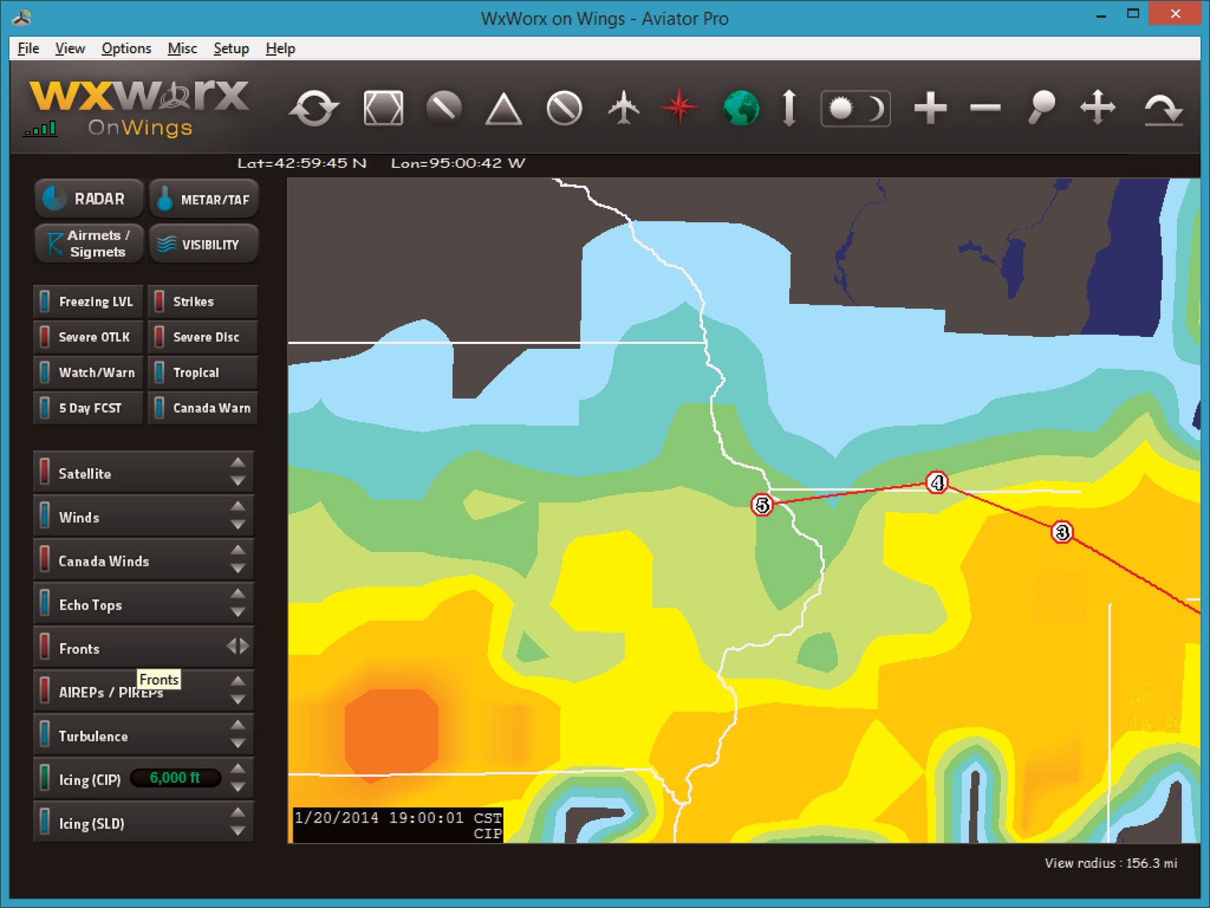
You page through the current icing product (CIP) and choose the level with the worst layer—6000 feet (Figure 5). What are we looking at? This graphic combines numerical model data with radar and observed precipitation data to estimate the icing potential at various layers. Values are expressed as probabilities, so intense, reddish shades do not necessarily indicate heavy icing but rather a high likelihood of any type of icing. Likewise, the SLD, or Supercooled Large Drop image identifies an environment that supports the occurrence of clear icing. Again it is expressed as a probability and does not convey information about intensity.
After reviewing the images, you think it over. “Well, it looks like it’s mostly to the south. I guess we can turn on the TKS and we’ll be in good shape.”
You ask Chicago Center if there are any ice reports and there are none, but just then another pilot comes on frequency. “Uh, we came out of Prairie Du Chien just now and picked up some light rime on the way up, maybe to 8,000, mostly just a lot of snow.”
Reports from other traffic are sometimes like striking gold. Prairie Du Chien is to our north, though, so we’ll have to stay sharp.
As we prepare for descent, the cockpit is frigid and my fingers are already numb. We’ve got the heat on full, but it’s -25 degrees C outside. We’re deep within a cold air mass and the mid-level winds are out of the northwest. Having a cold-soaked airframe could be a real problem if there’s a lot of humidity or mixed phases down below, but this isn’t that type of pattern.
Sure enough we descend through the muck and pick up the expected icing as we work our way through the snow. We gingerly work our way to the ILS, but we’re only getting light rime on the wingtips and not much is accumulating. So far so good. We break out of the jagged ceiling about 3000 feet and can see the golden pinpoints of farm security lights below. With curtains of ghostly snow all around, we can’t quite see the airfield, so we continue the procedure and pick up the glideslope.
As a veil of snow recedes and the airfield comes into sight we’re already crabbing into the wind and we’re bouncing around quite a bit. That good old instability is coming into play as cold Canadian air soothes its frozen boundary layer on warm Iowa soil.
“Cleared to land, Runway 36. Wind 040 at 13 gusting 20,” we hear from the tower.
That’s a significant crosswind and we’re all braced a bit for the landing. We clear the threshold, white-knuckle it over the numbers, and firmly plant the wheels onto the concrete. We taxi to parking, tie it down, get our bags, and walk to the FBO.
Dave is looking at his phone. “Hey, I think I’ve got some bad news. Turns out that was a PlayStation 3 they had, not a PlayStation 4.”
There is an awkward pause. “We spent $120 on gas to fly out to a snowstorm in Iowa, in January, for a game console that the store doesn’t have? Are you kidding me?”
“Well, you’ve got this great article about using datalink weather.”
“Yeah, I guess there’s that. Let’s see if we can at least get a good steak.”
Tim Vasquez is a professional meteorologist in Norman, Oklahoma. XMWX satellite weather is available on many devices and apps, and each adds their own interpretation. For this series, Tim uses WxWorx on Wings, a PC application from the data provider for XMWX.


