
Two years have passed since we discussed the Skew-T diagram, and it’s time to re-acquaint ourselves with this tool. This is no easy subject, but we’ll avoid the overly technical talk and focus on the important stuff.
Perhaps you resist the Skew-T due to its complexity, figuring you could just grab the upper-level winds and go. That’s up to you. Prepackaged weather is fine. But if you have a few minutes while planning your flight, why not dig deeper? The Skew-T gives you a vast amount of information about the atmosphere.
A number of free services like Pivotal Weather and Weathernerds let you click on your favorite location. Using forecast models like the HRRR and NAM, these sites show an accurate Skew-T for that location and time. Then you can see everything that you’ll encounter as you climb. Most of the users of these services are hobbyists, not researchers or professionals. If they can figure out these tools, you can too.
There’s no better way to visualize what’s happening in the atmosphere at a given point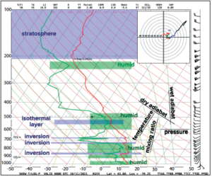 than with a Skew-T. The underlying principles are simple. Over the past hundred years, meteorologists have sought the ideal chart to see the weather aloft, using everything from simple Z/T charts to complicated emagrams and Refsdal diagrams. However the industry has found nothing better than the Skew-T. It’s here to stay.
The Skew-T
A Skew-T is a plot of temperature with altitude. But instead of the vertical guide lines of a normal graph, we skew the chart so that the lines on the x-axis slope to the right with height. Since standard temperature decreases with height, this makes the temperature graph stand tall and straight rather than leaning over to the left. This is why it’s a “Skew T” diagram: this configuration makes the temperature line easier to inspect, and important changes between different layers become more obvious.
Altitude on the y-axis is given in pressure—millibars or hectopascals. Unfortunately this system isn’t very useful for pilots, and even for meteorologists the pressure coordinate system requires some adjustment.
The easiest way to grasp this is to memorize some of the approximate values, and interpolate what you don’t know. Sea level is 1013.2 mb (29.92 in Hg), while 1000 mb is just a few hundred feet above sea level. And 300 mb is at 30,000 feet. That’s an easy one. Other key values are given in the table to the left. Note that these are geopotential (standard) heights and they’ll vary according to the density of the atmosphere, but they’re good enough for sizing up what’s happening.
Typically there are two data plots. The most fundamental is the temperature line, usually drawn in red, which plots the temperature with pressure. Most diagrams also show a dewpoint line in green to the left (cold) side of the diagram. To read these temperatures, use the values at the bottom of the chart, but note that the scale goes up and to the right. Thus, the temp and dewpoint at 300 MB are -40 and -60 respectively.
The closer the temperature and dewpoint lines are to each other, the higher the relative humidity. A rule of thumb is that when the lines are within five degrees Celsius of each other, the humidity is greater than 70 percent and clouds are likely. In the example we have shaded some of these levels in green. This suggests the potential for lots of low ceilings, some middle clouds, and even some cirrus. The local METAR reports confirmed ceilings were at 3000 feet and 7000 feet.
Evaluating Stability
One of the easiest things you can do with a Skew-T is find stable and unstable layers. Simply select a layer and look at the slope of the temperature line. The trick is to evaluate it against the wet adiabat, sometimes called the moist adiabat.
If the slope with height is to the right of the wet adiabat, we consider the layer to be stable. It resists vertical motion and tends to trap lower air masses and reduce wind speeds. Turbulence is unlikely. Clouds have a tendency to spread horizontally beneath these layers, producing stratocumulus and altocumulus. When the slope is so far to the right that it equals the slope of the temperature grid line, we consider it to be an isothermal layer. Any further slope to the right indicates an inversion, where temperature increases with height. Examples of these layers are marked on the chart.
If the slope with height is left of the wet adiabat, the layer is considered unstable. Vertical motion is likely with gusty winds, especially if this layer is deep and extends to the ground. Mechanical and clear-air turbulence are favored. The steeper the slope is to the left, the higher the lapse rate and the greater the potential for vertical motion.
The highest theoretical slope is that of the dry adiabat. We call such layers “dry adiabatic,” and they’re usually a sign of either strong solar heating or very intense upper lift, such as in strong systems emerging from the Rockies. It’s impossible for the lapse rate to exceed dry adiabatic. We call that “absolutely unstable,” and it results in spontaneous overturning that clears away the steep lapse rates. On rare occasion we see such layers in radiosonde data due to instrumentation errors, usually when they emerge from the top of a wet cloud and the sensor is evaporatively chilled. You won’t see this in model data.
Introducing SharpPy
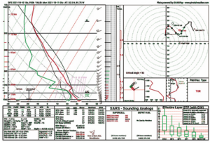 In Wx Smarts, we don’t simply cover weather hazards and building blocks. We show you what’s going on in the minds of aviation forecasters and keep you on the cutting edge of the latest developments. One of these new technologies is SharpPy, pronounced “sharpy,” which has brought about a mini-revolution in Skew-T diagrams. It’s a Python-language Skew-T display technology written by researchers in the severe weather community in Norman, Oklahoma. I absolutely love SharpPy because it simplifies the Skew-T and shows all the important stuff at a glance.
You’re going to be seeing more of SharpPy. Its unique displays appear in scientific journals and on websites all over the Internet. I’d suggest diving in and getting familiar with it now.
Go to the Storm Prediction Center Skew-T page at www.spc.noaa.gov/exper/soundings/. You can look at radiosonde data for over 100 stations going back a week. Another great data source is the actual model runs at Pivotal Weather. Go to www.pivotalweather.com/model.php, pick a forecast time, then click on any location. Select the HRRR or the NAM model type for same-day data; otherwise choose the GFS model for the best accuracy.
Reading SharpPy
SharpPy produces multiple charts and tables in one image. At the top left of the SharpPyis the Skew-T. You’ll notice wind aloft flags to the right. True north is always at the top of the page, so here we see winds mostly from the southwest.
On the right is a series of bars whose length represents the magnitude of the winds. Layers where wind increases dramatically over a given vertical distance are prone to clear air turbulence, such as that between 500 and 300 mb (18,000 to 30,000 feet) in the SharpPy example. And further to the right is a series of bars marked “Inf. Temperature,” or inferred temperature advection. This uses the backing and veering of wind to guesstimate whether warm air or cold air is being advected at each layer.
At the far left of the Skew-T is an omega scale, with short lines pointing either left (blue) or right (red). This indicates whether there’s upward (red) or downward (blue) motion at each level. This is just an estimate, and is only available if the Skew-T comes from model data. If there’s lots of red, there’s a good chance of clouds or worsening weather at that level.
At the top right of the SharpPy is a hodograph (next page). We won’t get too much into this, but it simply maps out the wind direction and speed at each level and connects the dots. It’s also marked with height from 0 to 6 km. 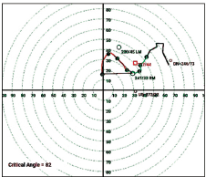 The longer the line is at a given layer, the stronger the wind shear. A long, snaking line means there are large changes in the wind through the atmosphere.
We have a storm slinky that shows the estimated horizontal drift of a balloon if it were to ascend in the storm updraft. This is mostly of interest to forecasters. There’s also a height-energy diagram that shows the amount of energy in the atmosphere in terms of its equivalent potential temperature; we’ll not worry about that. The storm 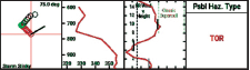 relative wind diagram looks at wind speed with height from a storm-relative frame, and is used to determine whether any supercells will lean towards LP (low precipitation) or HP (high precipitation) structure.
Finally there is the probable hazard type. This is useful for pilots. It uses a decision tree of important parameters, using the best available indexes, and identifies the probable risks. The complete list is TOR (tornado), MRGL TOR (marginal tornado), SVR (convective wind or hail), MRGL SVR (marginal risk of convective wind or hail), FLASH FLOOD, BLIZZARD, EXCESSIVE HEAT, or PDS TOR (particularly dangerous tornado situation). These are not final forecasts and sometimes they’re overdone, but the idea is to draw your attention to these being possibilities. They’re all computed from the Skew-T data.
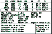 The thermodynamic parameters are useful for aviation. The CAPE parameter gives you the degree of potential instability in the atmosphere in j/kg; values over 500 support storms and over 1000 support severe weather. LCL, lifted condensation level, gives the convective cloud base height in meters, and EL, equilibrium level, gives the maximum storm tops in meters. Further down is DCAPE, which gives downdraft CAPE, or the energy available to storm outflow; values of over 800 indicate strong outflow is likely, and over 1200 favors downbursts. This is also one of the best parameters that I know of for microburst forecasting. In this example, DCAPE is 1472, so watch out.
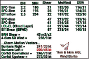 Wind kinematics show various expressions of shear. There’s not too much you need to worry about here. But the 0-6 km Wind value gives you a rough idea of cell motion. The Shear column under Eff Shear correlates with the ability of storms to organize. The higher it is, the more potential for severe weather in general.
The SARS – Sounding Analogs box presents severe weather case studies that closely match this sounding, along with their YYMMDDHH date-time code. It’s probably not of much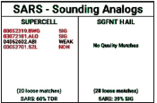 interest unless you’re a weather history nerd. But a large number of matches tends to correlate with a high likelihood of some severe weather.
Finally there’s the Effective Layer Significant Tornado Parameter, which simply rates the possibility of various tornado intensities. This probably isn’t your main concern, but if the Storm Prediction Center has your area in a risk category, you can check it out and see where the red line is. To see what kind of tornado intensity is most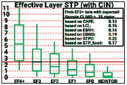 likely, according to a large climatological study, simply see which box and whiskers categories it intersects. The main value here is identifying large tornado events, which usually occur with values of two and above.
Now It’s Your Turn
I hope that this gives you enough to start using some of the Skew-T products that are available on the Internet so you can see what they offer. They’re not meant for pilots, especially weekend VFR flyers, but that doesn’t mean you can’t add them to your flight-planning sessions. I think of weather tools like these as shop tools, and who doesn’t like having a lot of tools at hand?
Tim Vasquez was an Air Force meteorologist in Texas, Korea, England, and Kenya, and now writes books and software. He has a channel on YouTube called Forecast Lab.


This is really a helpful article about the skew-T diagram; I have been looking at those on the pivotalweather.com web site, but had no clue about the SharpPy section of the diagram.
Many thanks to Mr. Vasquez for these interesting and helpful professional explanations !
Great article. I’m reading it online, and can’t see clear pictures that seem to go along with the text. I’m sure I’m missing something. The embedded figures are not clear enough to make out any detail, and they don’t seem to be links, either.
Concur with Alex – Diagrams would be far more helpful if they were enlarged with associated pointers for key points. My confusion between the text and the diagrams made this far more difficult to read and understand.
I am working my way through Scott Denstaedt’s “The Skew-T log (p) and Me” in a humble attempt to understand this powerful tool. I was familiar with the NOAA RucSoundings website, but certainly not the other sites offered in this article. I will certainly check them out. God knows there is so much more for us to learn…
Thanks, this was valuable, it really helped me!