
Jeppesen’s iPad app may be the weapon of choice for many airline cockpits, but we think it lags far behind other apps in features and usability. It’s not bad, it’s just incomplete.
Common wisdom in the computer world seems to be that if you’re not adding features at breakneck speed, you’re falling off the trailing edge into oblivion. We don’t subscribe to that thinking; a good program doesn’t need constant improvement to be a best tool.
But it’s nice to see all the basics covered, and that’s why we’ve been disappointed with the evolution of Jepp’s app for the iPad. It does many things well, some things poorly and a few things it doesn’t do at all, at least not yet.
Putting aside the Coke-versus-Pepsi argument about using Jepp charts versus Aeronav charts, and the fact that Jepp charts cost more (at least for the time being), here’s our report card on Jeppesen’s Mobile Flight Deck for the iPad as it exists today.
Lightest Binder Ever
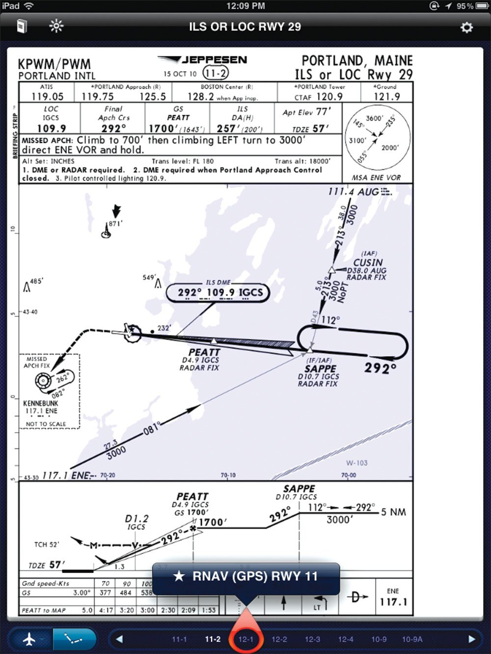
The app has two modes: en route and terminal. Terminal mode shows the famous Jeppesen approach charts and does it well. You can look up an airport by ICAO ID or by typing the name of a town or airport. The search is lightning fast. Tap an airport and you get all the procedures for that field. You can filter those by group (approach, SID, taxi, etc.) and assign favorites for easy viewing without searching.
One trick that seems unique to Jepp FD (and we wish other apps would steal) is that when you’re viewing one approach chart, you can easily scroll to others for the same airport without closing the chart and reselecting. This lateral navigation added to the drill-down/close-up style makes it a snap to change charts quickly in any way you see fit. The charts are crisp and zoomable. You may need to lock the screen to get landscape-orientation charts to stay the way you want them.
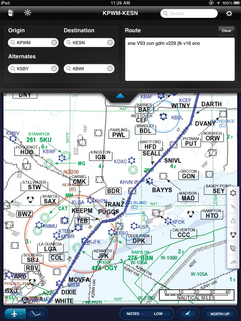
The app lets you define a departure, destination and two alternates. The charts for these airports are automatically grouped in their own tab for easy viewing. It’s a simple feature that works.
Approach charts won’t show your position even though Jepp has the capability to do so. Their reticence may revolve around airline users. Jepp tells us they may turn on this feature in the future. These are also complete representations of paper charts; there’s no option to not view data you don’t want, as can be done on the Jepp FD en route charts.
Speaking of En Route
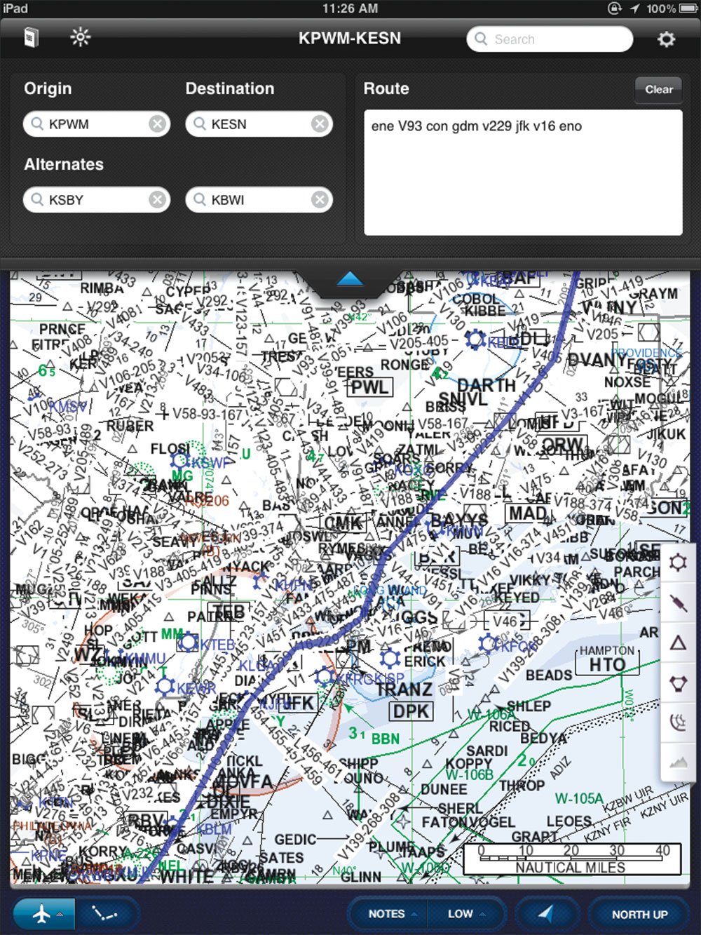
Virtually all the aviation iPad apps show zoomed versions of paper Aeronav charts. Jepp handles the en route charts the way it has with its PC- and Tablet-PC-based flight planning software: The charts are created on the fly to resemble the Jepp paper charts, but only show the amount of detail appropriate for the zoom level in question. It also means the map can be oriented track-up and have all text still appear upright.
At least, that’s the theory. In practice, we found the chart errs toward being too cluttered until you zoom out to show hundreds of miles or zoom in to show only a couple dozen. This isn’t a big deal in practice because it’s so fast to zoom with pinching on an iPad. You can also turn on and off several options for any data layer. Turning off airways and waypoints clears the clutter at any zoom nicely, and the app always shows the waypoints and airways on your route, so this is a viable way to control clutter.
Tap on any map feature and you get a pop-up window with detailed information for that airport, airspace, naviad or whatever. The app will ask which item you mean when it’s not sure which of several objects at that spot you want. Jepp could take a lesson from apps like ForeFlight or even PilotMyCast in using some graphical presentation to make this data easier to parse; it’s all text. But it is available, including airspace info.
When you enter your departure and destination, you can also put in your route with victor or jet airways—always welcome. It doesn’t understand if an intersection between two airways isn’t at a navaid or waypoint, but quickly scrolling the map to that point usually presents a quick solution. There’s also no editing of the plan on the map, direct-to a waypoint or saving of routes you use reguarlly, as you’ll find in other apps, although these are likely features in the future.
The en route map will show your position if the iPad has a GPS. We found it a bit finicky, occasionally getting confused on our exact position or direction when other apps, such as ForeFlight, had no such trouble on the same hardware. There’s no way to show GPS-derived speed, altitude or track on the maps or charts. Jepp says this is to keep the view clutter-free. GPS position accuracy shows on the updates page, of all places. If you’re having trouble getting the app to show your position, check here. You may see “ownship” is disabled due to GPS accuracy issues.
On a more global note, both sides of the app ran at acceptable speed on our now-dated iPad 1. There’s a good brightness control that actually gets dim enough for night flight (an issue on the iPad). The Jepp manual is included in the app. So are the release notes for each cycle. As we’ve mentioned before with digital charts from Jepp, it’s important that you check these notes with each download cycle as they reserve the right to not include charts if they have too many revisions in a datacycle. Don’t check the notes and you won’t know—until you go to pull up a chart and it’s not there.
Download control on the app is simple, but that’s a double-edged sword. You are notified of downloads and you tap to start the flow, but there’s no way to just download part of the data if you’re in a hurry and just need the latest for one airport.
Of course, with Jepp there’s always the money issue as well. It’s unclear how much more expensive Jepp will be than Aeronav for digital charts because the Aeronav base price that all vendors will soon have to pass on is still in flux. But Jepp will always be more expensive. One big plus of digital, though, is you can subscribe to a limited region but then extend for trips as needed. The new charts can be on your iPad as little as 30 minutes after you order the trip kit.
Punch List
Jepp tells us datalink weather and more advanced flight planning are in the works for this year. It would be a big plus to Jepp FD if it could download all airport NOTAMs before the flight from the internet and you could review the pertinent ones as you selected an approach later in the flight. Jepp also tells us that a VFR version is likely to appear, offering just the en route features for much less money.
Our walk-away feeling is that if you’re already a Jepp chart user and want to keep it that way, Jepp FD has enough functionality to keep you satisfied, if not thrilled. The app is free to download and use if you’re already a digital chart subscriber. And when we say not thrilled, we mean in comparison to other options for charts and flight planning on the iPad. Compared to five binders of paper, Jepp FD is a walk-away winner.
Compared to Jepp FliteDeck on a Tablet PC, it’s less clear. FliteDeck has far more functionality but the iPad is a much more comfortable form factor. If the app grows up to add the capability of its competition—without getting so bogged down in features that it becomes unusable—it could be a real contender for a choice cockpit tool.


