
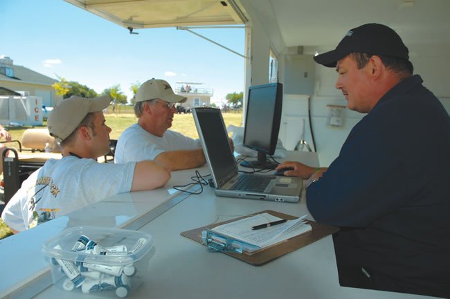
I used to get occasional in-person briefings when I lived in the Emerald City. That’d be Seattle, Wash., not somewhere in Oz, but it might as well have been a fairy tale for all it matters now. Before the mid-’80s there were over 350 FSSs around the country. Unless you’re in Alaska, that’s all gone. Flight Service (run by LockMart under contract) briefs over the phone—if you bother to call at all.
That’s a real loss, because I always learned something in those one-on-one briefings. The briefer would point to a Prog chart showing low pressure moving into British Columbia: “Now this looks like it’s gonna roll right through the south tip of Vancouver Island. If that happens, the winds will be blowing like stink when you try to get back here tomorrow. You’ll have great groundspeed, but landing could be tricky …”
While the service from Flight Service has gotten better, we still don’t have that interactive briefing where we can see the same screens as the briefer. This leaves a pilot in the nebulous world of listening to a droning phone voice making non-committal “VFR-not-recommended” or trying to parse on their own the mountain of data that’s out there.
Hazards, Visibility, Winds
If you’re feeling overwhelmed by internet weather or underwhelmed by your phone briefings, here’s one way to take charge of things. Break it down into the three items you really need to know about: hazards to flight, visibility (which includes ceilings), and winds. This mindset works whether you’re flying a legacy sport plane or a pressurized twin. It’s just the limits you set on those three items that change.
Hazards are anything that’s dangerous to your aircraft and proficiency level. Some items should catch everyone’s attention, such as Convective SIGMETs. Other items might only be a concern to certain aircraft, such as an AIRMET for moderate icing. Whether you’re listening to a briefing or working your way through one online, listen or look for words like convective, unstable, freezing level and gusting. These are clues to make sure you have thought about how the associated weather might affect your flight. As you identify each potential hazard, you either create a solid plan to avoid it or you cancel the flight.
For example, if you hear the air is “moderately unstable” for your morning flight, your hazard meter should trip for thunderstorms and turbulence. Pursue that thinking further: Will these be a hazard when and where you’re planning to fly, or just an annoyance? If they’re not widespread, move on because you can probably deal with it en route as well as you could plan for it. If they are a real hazard, then you need to formulate a Plan B before takeoff so it’s ready to go. Or you might need to not go at all.
Regulations aside for a moment, icing can be treated the same way. Is this a hazard or an annoyance? Let’s be clear, though: Lingering in any amount of icing in almost any aircraft should be thought of as a hazard. So your thinking here is more about how great your exposure is, to what level of icing, and what resources you have to mitigate the effects of those two factors. Light to moderate icing with clear above 15,000 is an annoyance for a King Air. It’s noted, but no special plan is made to deal with it. Same situation in a Cherokee might mean it’s VFR below the clouds (avoidance plan) or staying home.
The visibility step separates the VFR folks from the IFR ones. For VFR, low or no visibility is a hazard. For IFR, it matters only for the takeoff and landing. Look for information accordingly. This data is usually pretty straightforward, but there are still a couple tips to catch lurking problems. The well-known item is to watch the temperature-dewpoint spread. Any time they come within two degrees of each other, it’s worth looking further. If you’re comfortable with Skew-T charts, looking for a “fold-over,” where the temp and dewpoint decrease slowly and at a common rate with altitude (the dewpoint folds over the temp and both lean right), is a clue fog is in the works.
Another item to watch for is an amended forecast. The weather played out differently than expected to such a degree they changed the forecast. This should put all forecasts in that area of the country in question. What changed from the old forecast? Are things playing out better? Worse? Are systems speeding up (usually meaning more potential hazards like convection), or slowing down (usually meaning worse visibilities that take longer to clear)?
Corollary to the amended-forecast idea is always noting the issue time, as well as the effective time for all forecasts. It’s common to scroll through a series of 12-, 24- 36- and 48-hour prog charts only to note that the first two were issued four hours ago, but the last two were issue nine hours ago on less up-to-date information.
Just like hazards, you either note that the visibility requires no pre-takeoff plan, or you make a plan to deal with it, such as an approach. No viable plan means no flight.
The final step is thinking through the winds. This step is easily and often skipped, especially when wind data and fuel computers are so common in the cockpit. But there are so many missed opportunities or unnecessary discomforts that could be avoided with a little checking. Finding the best-time or best-efficiency altitude is child’s play with websites like Fltplan.com. Even small savings add up over time. The Skew-T can be handy again for finding bands of stable air that usually mean a smooth ride.
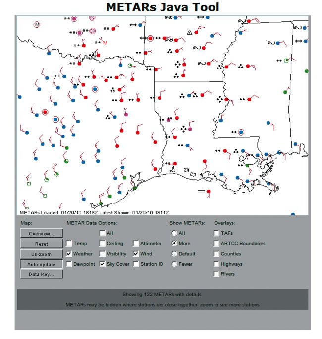
You can often use winds to map major weather patterns to their real, current position. One of my favorite tools is the METARs Java tool or the same view in the Flight Plan Java tool from ADDS. In either case, you can view METARs over a wide area with color coding for good VFR to low IFR conditions, but you can also see winds at the surface. (The barbs are the direction the winds are coming from.) Finding the wind shift at the surface is a great indicator where the front in question was at the top of the last hour. Compare that to where the front shows on the last surface analysis chart at the time the chart was issued, and you’ll get a sense of how fast it’s really moving relative to places you’re planning to go.
Armed with Knowledge
This three-step process is really just a top-level organization for a much deeper study of weather that’s forever a learning process for the proficient pilot. But it’s still a useful tool to some for making a mountain of data more manageable and choosing which items to investigate more fully and which to dismiss; and for deciding when it’s necessary to make a real plan, and when it’s better to just work it out as you go.


