
Since the mid-1970s, satellite imagery has made its way into everything from television weathercasts to flight weather briefings. We see them constantly. When a hurricane is approaching the coast, viewers are presented with satellite images. When the local news shows the forecast, a satellite image is almost always used. This technology has grown progressively more complex and powerful over the years, and more than ever it can be a valuable part of flight planning. Let’s examine some of the basics of the technology and look at today’s capabilities.
How It Started
What we know as satellite imagery is simply the art of parking a camera in space and pointing it at earth. The earliest known photos of earth from space were taken from German V-2 rockets launched by the U.S. Army after WWII. The first U.S. satellite was Explorer 1, launched in 1958, and this was followed in 1960 by a very important satellite: TIROS (Television Infrared Observation Satellite), the first Earth observation satellite. TIROS gave mankind their very first weather pictures from space. Unfortunately the images were taken using primitive—by today’s standards—television cameras, and it was almost impossible to match geography to the images in real-time.
While the technology provided an interesting testbed throughout the 1960s, a massive upgrade was on the horizon. This would involve boosting new satellites up to 22,000 miles, where the satellite orbit could match the rotation of the earth, essentially locking them to a fixed spot above the Earth’s surface. This allowed continuous coverage and greatly simplified the process of aligning the underlying geography with the weather images. High-resolution digital cameras would also provide much higher-resolution images. Plus, the downlink transmissions used multiplexing techniques, allowing more data to be sent to Earth.
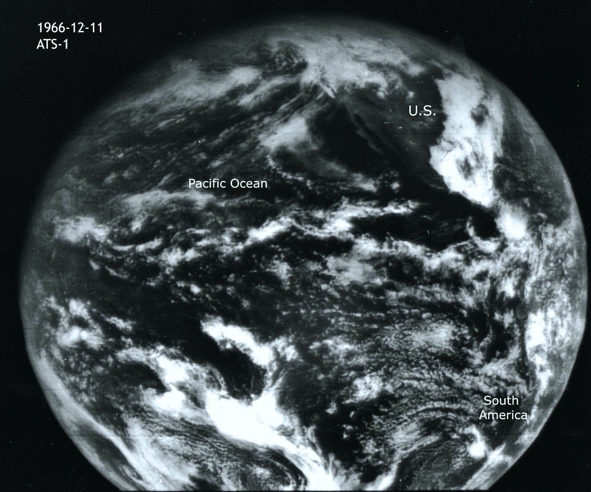
The first of these satellites was the ATS (Applications Technology Satellite) series, launched in 1966. Several of them were launched, providing a valuable experimental testbed. These led to the experimental SMS (Synchronous Meteorological Satellite) series, launched in 1974, and finally the highly successful GOES (Geostationary Operational Environmental Satellite), with GOES-1 entering service in 1975. One new GOES satellite has been launched roughly every two years, often with upgrades. These have delivered the vast majority of weather images of North America over the past several decades. The latest GOES satellite is GOES-17, which entered service in February 2019.
Geostationary vs. Polar Orbits
Most of the weather satellites we’re familiar with are geostationary, fixed over one spot on the Equator called the subpoint, which gives its rough location and is expressed in degrees of longitude. U.S. meteorologists have a shorthand for these subpoints, called the GOES West, GOES Central, and GOES East locations, positioned at 135W, 90-105W, and 75W respectively. For example, when you want to look at California, you’ll use the GOES West satellite for the best results. These names refer to the positions rather than to the satellites themselves. The GOES Central slot is often empty; as of 2019 no satellites are in this position.
When there are failures in the geostationary satellites or new ones are launched, the NOAA Satellite Operations Control Center in Maryland will often play a game of musical chairs with the GOES constellation, using their slow-burn rockets to push individual satellites to a different subpoint to get optimal coverage and fill in gaps. So don’t be surprised if your usual satellite imagery seems to look a bit different from one week to the next.
There is a completely different class of satellites known as polar orbiters. These operate at much lower altitudes, about 500 miles above the Earth instead of 22,000 miles. U.S. polar orbiters for weather are often referred to as POES (polar operational environmental satellites). Since gravity is stronger at these low altitudes, and the satellites are in a polar orbit, these are not geostationary and will pass over any given point on the Earth only twice a day.
TIROS, the original American polar orbiters, became the NOAA satellite series, the latest being NOAA-19 which was launched in 2009. You may be familiar with these satellites since they’re the backbone of the EPIRB (Emergency Position Indicating Radio Beacon) emergency rescue system. On average every year they save about 200 lives at sea, 25 pilots and passengers from downed aircraft, and 50 people on foot.
The NOAA satellite system is in a state of transition and is being replaced by the Joint Polar Satellite System (JPSS). One prototype satellite called Suomi was launched in 2011. NASA also operates two important weather polar orbiters known as Terra and Aqua, which were launched in 1999 and 2002.
You typically don’t see polar orbiter images unless you’re looking for them specifically. However there are many good sources of real-time imagery on the Internet, one being the NASA Worldview website found atworldview.earthdata.nasa.gov. This site has all the latest Terra, Aqua, and Suomi images. It’s a good resource.
You might ask why we bother with polar orbiter imagery when the GOES products are so good. For scientists, polar orbiters allow specialized sensors to get closer to the weather. For the rest of us, you get 100 percent coverage of the planet twice a day. GOES can effectively see only about a quarter of the Earth’s disc. Also GOES satellites can’t see the polar regions very well, so above 65 degrees latitude you should be checking polar orbiters like Aqua and Terra.
Also, only about 10 percent of weather agencies outside the U.S. provide free exchange of scientific data. If you’re trying to find detailed high-resolution images for certain places in Asia or Africa, the polar orbiters might be your only option without subscribing to an expensive data provider.
There is one final thing to be aware of: image mosaics. Some websites and data services blend images from multiple sources. This is most commonly seen with “worldwide” or continental satellite pictures, and you can usually see seams in the picture where images have been stitched together. If the legend has no indication of which satellite it came from, it could be from multiple sources, including polar orbiters.
Visible Imagery
Now that we’ve got a better idea of which satellites are available and how they got where they are, let’s look at the technology. Most satellite systems actually carry a large package of scientific instruments like X-ray sensors, UV instruments, and space weather sensors. These might be useful if you’re a mad scientist working in your underground lab, but we’ll focus strictly on the weather images.
In the GOES satellite, the image sensors are contained in a package called Advanced Baseline Imager (ABI), which is an upgrade of the Advanced Very-High-Resolution Radiometer (AVHRR) on previous satellites. It can image the Earth’s disc every 15 minutes, or as often as every five minutes for the United States at a resolution of up to 500 meters.
The simplest ABI output we get is visible imagery. This is almost identical to what you’d see if you took a picture of the Earth with your smart phone. Brightness is proportional to albedo, which is the amount of light reflected from land, clouds, and sea. The brightest weather objects are fresh snow and cumulus clouds, which reflect about 95 percent and 75 percent of the light respectively. The brightest land feature is dry sand, reflecting 40 percent of light. In fact White Sands, New Mexico was often used by forecasters in the 1970s and 1980s to check for proper georeferencing of images.
The main advantage of visible imagery is that it offers the highest resolution. It’s often possible to see the patterns of strip malls and airports around big cities. The images are also very intuitive as the view is similar to what we see from the cockpit. The negatives are that visible images don’t give us much quantitative information since we’re only seeing brightness, and no images are available at night (though moonlight reflectance images exist and have slowly improved since the 1970s).
Infrared
The real power of weather satellites is in the infrared channels that observe a longer wavelength than visible light. All objects, such as land, sea, and clouds, radiate longwave energy, even at night. If the sky is overcast, the escape of infrared energy from the surface is blocked and we only see the feeble infrared energy from cold cloud tops escaping into space. Brightness is inversely proportional to temperature, so bright areas indicate very little radiation is reaching the satellite from either land, sea, or cloud at that spot.
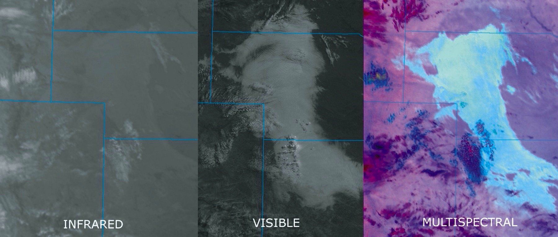
The vast majority of satellite products you see on television and on aircraft datalinks are in fact shortwave infrared imagery, centered at the 10-micron band. This yields a product that looks almost like visible imagery but is available 24 hours a day, maximizing consistency of the product. But there are important distinctions. For example in the winter, cold regions will appear to have a large, bright cloud layer, but what you’re seeing is actually the cold surface temperatures. Cirriform clouds are very cold, making them stand out on infrared imagery, but appear medium-gray on visible imagery because of their modest albedo. With infrared imagery always remember you’re looking at temperature.
That illustrates the importance of knowing whether you’re looking at visible or infrared imagery. As a forecaster I find that I never start using any imagery without knowing for certain what type of image it is. The easiest way is to look in the product legend for abbreviations like VIS or IR. The wavelength might also be marked with “UM” or “MICRONS”; anything above one indicates infrared. Another easy trick is seeing whether it’s nighttime. If it is and you see distinct clouds, it’s obviously an infrared image.
Also check the western United States for vegetation and terrain. If you see a rich variety of shading during the middle of the day, this indicates visible imagery. Infrared imagery shows mostly vague furrows following the mountain ridges.
During the daytime, a go-to feature is fair-weather cumulus clouds. If it’s a hot summer day, see what the cumulus clouds look like. On visible imagery they’ll look like popcorn, but on infrared they’ll be invisible or look like dull patches. This is because the cloud top temperatures are fairly warm, like the surface, and the individual clouds are smudged out by the coarse infrared resolution. Showers and thunderstorms, however, will be bright due to the cold tops.
Colors can be added to satellite imagery and this is known as enhancement. It is always an indication of infrared imagery. Enhancement schemes were developed in the 1970s to bring out contrast, since basic infrared imagery is grayscale and the eye can only distinguish a small number of gray shades. NOAA defined standards in the 1970s for them, and the MB and ZA curves were widely used until the 1990s. However these standards fell out of use after personal computers allowed users to make up their own colors, so don’t read too much into the actual colors.
Things To Look For
One of the single biggest weather problems on weather satellite pictures is fog and low stratus, the same elements that are challenging to pilots. Here it’s particularly important to know if you’re using visible or infrared images. If you’re using random satellite products on XM Weather to find fog without knowing what you’re looking at, you’ll be in for a surprise.
Visible imagery presents fog and stratus as a solid white, featureless mass. You can tell the difference between fog and stratus by seeing if the edges of the white mass follow the terrain. Fog strongly favors river basins and valleys, so the edges will often show tendrils into these areas. Stratus ignores the terrain and shows smooth edges. In mountainous areas such as the western states, fog and stratus are both affected by the terrain.
On infrared imagery, fog and stratus are almost invisible, because the cloud top temperatures are similar to that of the ground. The mass will appear dark or medium gray, as if clear skies are present. However there is one distinct clue on infrared animation: the extinction of lakes, which during the cold season appear as a darker color. When the lakes suddenly disappear, this means stratus has probably advected over the area, blocking the radiation from the lake. The familiar nighttime radiation fog doesn’t do this since it prefers to cling to cool land surfaces.
However with some scientific trickery we can combine and subtract various infrared channels and reveal both clouds and fog in vivid detail. This is called multispectral satellite imagery, and is highly useful if you fly a lot at night. A good source of multispectral images is atweather.cod.edu/satrad. if it’s nighttime simply pick a sector and zoom in, and click on “NT Microphysics.” You could be amazed at what you see.
Another important point is that there is a wide range of quality on Internet websites, and it’s important to sort this out before you start using them for flight planning. Many sites provide poor-quality, low-resolution images that are zoomed out too far. However others likeweather.cod.edu. offer a rich assortment of state-of-the-art images at a wide range of scales.
In conclusion, the newest GOES satellites feature impressive technology, far beyond anything we had even in the 1990s. On a good satellite website, you can get crisp state-level images from GOES-16 or 17 that are only 60 seconds old.
Now that you have a better understanding of the technology, what’s out there, and how to use it, I hope that invites you to take a closer look. It’s easy to see that this is the next best thing to being there and can be a massive supplement to hunting through METAR reports, particularly if you do a lot of mountain flying or cover long distances. Hopefully you are getting the picture now, so to speak.
Tim Vasquez, a former Air Force meteorologist who now writes weather textbooks and analysis software, can say he would be lost developing a forecast without satellite imagery.


I would like to supplement, although a small, but very interesting and useful article, with information that I recently read about historical satellite images. I think it will be relevant here. Because satellite technologies are developing, and it will always be interesting to look at historical satellite images and find out information about them anyway.