
In the summer of 2014 the FAA published in the Federal Register its intent to do away with the Area Forecast (FA) and replace it with digital and graphical alternatives. The agency wrote that the FA was a “broad forecast of limited value” and that better alternatives existed. We wrote about the demise of the forecast in “FA Swan Song” in our July, 2015 issue.
This January the National Weather Service released an Experimental Graphical Forecast for Aviation (GFA), which the Service says is a graphical replacement of the text FA. Is it? Does it contain information pilot’s need? Can you determine if an alternate is required or an airport qualifies? Let’s find out.
Meet the GFA
The GFA includes “observations and forecasts valid for the continental United States that provide data critical for aviation safety.” Reports from the past six hours and forecasts up to fifteen hours into the future are available. Weather information is displayed as overlays on top of a customizable and scalable basemap.
Many of the weather overlays should be familiar—they’re available on the Aviation Weather Center web site—but the GFA consolidates them into one place. The observations and warnings map is a combination of the graphical METARs, TAFs, SIGMETs and radar. The Icing forecast uses the existing Current Icing Product and Forecast Icing Probability charts. The turbulence map uses the Graphic Turbulence Guidance already in use, and wind barbs displaying winds aloft are nothing new. All of that should be at least familiar to many users, but the Clouds and Ceiling/Visibility overlays are novel.
The Clouds overlay uses NOAA’s Rapid Refresh Model (RAP), a meteorologist’s dream. Surface observations, radar, commercial aircraft, satellites, and weather balloons are inputs to the model. It outputs a three-dimensional forecast of the atmosphere over the U.S. in a 13-kilometer grid horizontally and 50 intervals vertically, extending up to 10 minibars, or about 85,000 feet. The model updates every hour and provides hourly forecasts out to 18 hours.
A new experimental version of the RAP, called the High Resolution Rapid Refresh (HRRR) model, is dropping horizontal spacing down to three km and providing forecasts at 15-minute intervals.
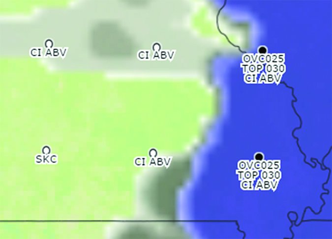
The RAP is used to create the Clouds overlay. Grid circles indicate cloud fractions (few, scattered, broken and overcast) and mark the location of forecast bases and tops. A purple cloud indicates clouds below 18,000 feet and gray indicates clouds higher.
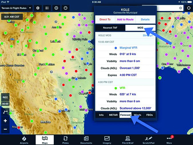
Another product important for instrument fliers is the Ceiling/Visibility overlay. It is based upon METARS for past and current conditions, and LAMP, the Localized Aviation MOS Program. (Ya gotta love their use of an acronym inside an acronym.) MOS stands for Model Output Statistics, which is a fancy way of taking a generalized model and applying it to a specific location, known as a point forecast. This is useful to pilots because we’re usually most interested in weather at points, airports or VORs.
ForeFlight users can view MOS forecasts for—according to ForeFlight—over 2100 airports. The rest of us can Google GFS MOS station bulletins and decode the resulting hieroglyphics.
LAMP improves upon MOS by updating it with local weather and statistical processing, which results in better early forecast projections and overall persistence. According to the NWS, over 1500 stations have LAMP forecasts.
LAMP and MOS both provide information in increments important to instrument pilots.
Unfortunately, the GFA does not separately display LAMP forecasts. (Remember, LAMP contributes to the GFA’s Ceiling/Visibility overlay.) Instead, colored clouds describe flight conditions, ceilings or visibility. For airports that don’t have METAR reports or forecasts, it’s important to understand how ceilings and visibilities are estimated. Describing the interpolation process, the NOAA states it, “in effect, ‘stretches’ limited-area METAR observations across the broader domain between stations while an accompanying process accounts for terrain effects on ceiling height.” This connect-the-dots approach does get some minimal cross-checking and, presumably smoothing, but still lacks the detail and accuracy expected of specific point forecasts. Nonetheless, it’s the best we’ve got.
Navigating the GFA
Now that we know a little about what we’ll see, here’s how to get there. Under the Forecasts tab of Aviationweather.gov is a link for the Experimental Graphical Area Forecast, or GFA depending on screen scaling. The default setting is observations and warnings. This map is populated with surface readings displayed in a manner similar to a surface analysis chart. A nice feature is that the circle will change colors if the conditions are VFR (green), MVFR (blue), IFR (red), and LIRF (purple). PIREPS are also displayed. As the time slider is moved into the future, METARs are replaced by TAFs. Overlaid on the map is radar imagery, SIGMETS and NWS warning areas.
Along the top of the window are radio buttons to toggle between various types of overlays; observations/warnings, thunderstorms, precipitation, ceiling and visibility, clouds, ice, turbulence and winds. A “Display Time” slide bar allows changing the time; the present time is the default. Just right of that is a button that allows the display window to be popped out for better viewing. For altitude-specific information like winds, a vertical slide bar is depicted on the left of the map.
That’ll get you around the basic product. Next to the weather radio buttons along the top bar are two buttons that allow the display to be customized. The first allows customization of how the weather is displayed and the second changes the underlying map.
The gear symbol, formerly the configuration button, adjusts how weather info is displayed. A nice feature, and the first one, is hover. By checking hover, a text description will be displayed when hovering over a feature. Otherwise, clicking on an object will display textual info. The rest of the options allow changing the default weather settings for the map. Note that selecting a new weather radio button will return the weather displayed to the default associated with that button. This can get you in trouble if you think G-AIRMETs are being displayed when they aren’t.
Next to the gear button is a world symbol, formerly the map button. This allows the map to be customized. The first dropdown tab is views. The first view is the contiguous U.S. (CONUS), followed by four user-defined views. These are easy to set. Just zoom in or out to the desired view, click on the user setting you want to use and there will be a tab to name and save it. The basemap feature changes what is displayed on the background map: terrain, road, satellite, light, dark, or simple. Terrain can be useful.
Next down is map overlay. The first options are highways and roads—”I follow roads,” anyone?—jet routes, ATC boundaries, navaids, and airports. I often select NAVAIDs and airports. This setup can be too busy when viewing observations and warnings, but works well for most of the other maps.
What We Get…and Don’t
It’s important to know what we’re getting and not getting with the GFA.
We’re not getting a meteorologist. The screens available on the GFA are the result of computer models. Meteorologists use information available in the GFA when creating an FA, but that information is then filtered through experience and knowledge. Experience makes a difference when forecasts conflict, which does happen. To get a meteorologist’s view after the FA is gone, we’ll have to review center weather advisories.
The GFA has a significant advantage over FAs as it includes SIGMETs and AIRMETs. FAs are forbidden from stepping on the toes of SIGMETs and AIRMETs. Aviation Weather Services points out in bold print, “hazardous weather (e.g., IFR, icing, turbulence, etc.) meeting AIRMET or SIGMET criteria are not forecast in the CONUS or Hawaii FAs.” But, there seems to be no problem displaying AIRMETs or SIGMETs on the GFA. Go figure.
The Ceiling/Visibility and Cloud maps add necessary information for instrument pilots when operating to airports without a TAF. These charts allow a pilot to determine if an alternate is required and if weather will be suitable to use an airport as an alternate. Selecting ceiling and visibility independently on the Ceiling/Visibility overlay allows determination of forecast conditions in increments that matter.
It’s important to note the limitations of the ceiling and visibility interpolation. Additionally, forecast cloud heights can vary significantly between the Ceiling/Visibility and Clouds screens. In one randomly timed check, I found the Ceiling/Visibility overlay forecasting a ceiling of 300 to 500 feet over southeastern Michigan while the Clouds chart showed bases between 2500 to 3500 feet. That’s a big difference.
In addition to occasional inconsistencies between products, operationally the GFA is still a little clunky. Using a normal size laptop or an iPad, some of the symbols are excessively small and hard to see. Zooming in on the iPad caused crash for me. Occasionally there are so many warning boxes that the cursor gets stuck.
It’s not love at first sight, but it’s growing on me. The GFA makes it easy to select a time and click through the different maps to get a good sense of what’s going on. The Ceiling/Visibility and Clouds maps provide the information necessary “to interpolate conditions at airports which do not have a Terminal Aerodrome Forecast (TAF).” (Aviation Weather Services, p.7-1) It is important to watch for differences in forecast models, understand a little about how they are created and take a conservative approach. I don’t know if I’d say the FA is of limited value, as the FAA did, but I’m getting prepared for it to drift away into the sunset.
Jordan Miller is going to miss torturing students with esoteric contractions used in the FA. Besides being an ATP and CFI, he is also a six-sigma yellow belt. (Whatever that is.)


