
Over the last few years, approach procedure charts have more and more data crammed onto them by the FAA. More data means better decision making, right? Ideally, yes. However it also means more brain cycles spent processing the data in addition to shrinking available chart real estate.
The FAA has recognized the visual clutter concerns and has been gradually adding symbols to their charts featuring silhouetted letters instead of adding lengthy notes scattered around the charts. This certainly does reduce clutter, but at the expense of potentially adding to confusion for pilots who don’t remember what those symbols mean and don’t have the latest decoder ring.
Hopefully any instrument rated pilot will know immediately what the inverse T and A in triangles indicate on a procedure, but what about the inverse D, W and C?
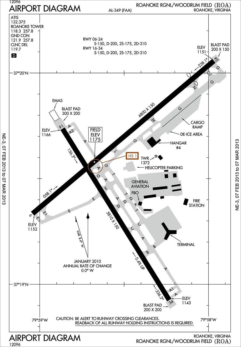
Just How Long is That Runway?
A commonly found symbol is the located at the top of the inset airport diagram on approach plates, or below the communication frequencies at the top left of full-page airport diagrams. It is intended to make pilots aware that runway declared distances are available for the airport, and are located in the Airport/Facility Directory. Remember those things? That data has actually been included in the AF/D for quite a while, so this may be a way for the FAA to remind pilots that the AF/D has information not provided on approach plates.
It turns out that runway length isn’t as straightforward as measuring the length of the chunk of pavement from one end to the other. The declared distances are a set of four distances computed according to FAA design standards to indicate the distance suitable for meeting various aircraft performance requirements by accounting for the length of features such as displaced thresholds, stopways, clearways, and other safety zones.
Declared distance information is primarily of interest to pilots of turbine aircraft for use in performance planning, but it is certainly of interest to all pilots to know exactly how much runway is available. This information is required to be available for Part 139 certified air carrier airports, but may also be available for other airports as well. Jeppesen typically provides this data on the back of the airport’s 10-9 chart. If there is no 10-9 chart, the runway length data is below the airport diagram on the back of the 11-1 chart.
But, of course, it’s not quite that straight forward. They introduce some acronyms that may be new to you.
TORA, Takeoff Run Available, is the runway length available and suitable for the ground run of an aircraft taking off, which is usually the physical length of the runway.
TODA, Takeoff Distance Available, is TORA plus the length of any remaining runway or clearway beyond the TORA distance.
ASDA, Accelerate-Stop Distance Available, is the runway plus stopway length which is suitable for deceleration following an aborted takeoff.
LDA, Landing Distance Available, is the runway length suitable for landing minus the length of the approach end displaced threshold and adding the length of the departure end displaced threshold or available safety areas.
WAAS Up?
A symbol that is becoming rare is the found in the notes section of GPS approach plates indicating that outages of WAAS vertical guidance in the area occur often enough that you should just assume that it won’t be available. The FAA won’t even publish NOTAMS about outages at this location. You will see this symbol depicted on GPS approaches that have WAAS minimums (LP and LPV) that are at the fringes of the WAAS service area. Jeppesen charts provide the same information through a full-text chart note.
Arriving at your destination only to find it’s below minimums because WAAS is unavailable, preventing your GPS from shifting into WAAS-minimums mode, is a situation most pilots would want to avoid. Therefore, for destination and alternate planning, only LNAV minimums may be used. If, upon arrival, you find that WAAS is available, then WAAS minimums may be used for the approach.
Expanded Circling Area
Here is one that you probably haven’t seen yet, but should start noticing around the time you’re reading this. A on the circling minimums line indicates that the circling minimums were determined using new circling area dimensions, which significantly expand the circling area for all categories.
Circling minimums are determined by finding the tallest obstruction that lies within the circling radii and adding at least 300 feet. With an expanded circling area, you have more wiggle room to maneuver, but at the cost of potentially higher minimums than previously existed, since more obstacles must be considered when determining the MDA.
The goal of the new criteria is to allow pilots to fly wider circling patterns in order to minimize low altitude unstabilized yanking and banking with unusually steep turns and descent rates. Additionally, the new criteria account for increases in true airspeed with altitude by providing wider areas at higher altitudes. For instance, under the old criteria, category B aircraft are provided a 1.5 NM circling radius, whereas with the new criteria, the same aircraft is provided a radius of 1.7 NM to 2.1 NM, depending on altitude. Categories C and D circling radii are dramatically increased under the revised criteria.
A frequent IFR checkride trivia question has been to list the radii for which circling approaches provide obstacle protection for various approach categories. That question is about to get a lot more complicated because the old and new criteria will exist in parallel for a while. New and revised procedures will use the new circling radii (with the symbol), however the old circling radii will still apply to previously developed procedures (lacking the symbol). Eventually all procedures will be updated to use the new radii, and the symbol will go away entirely, but that process could take years.
Find Your Decoder Ring
If you’re using the FAA’s AeroNav approach charts, each regional booklet has all the legend information in the pages at the front of the booklet. Many of the electronic applications using AeroNav data also provide these sections. For example, ForeFlight’s iPad application makes the legend material available through a download of “Digital Terminal Procedures Supplemental” from the built-in document viewer. Jeppesen paper charting products provide the legend information in the Introduction section, which is also available in the JeppView electronic chart viewer.
The FAA’s decision to favor symbols makes sense. A cluttered depiction of a procedure makes it difficult to find the information that you need and reduces your confidence that you haven’t missed anything. I’m sure most of us have seen procedures with what seems like a novel in the notes section, so having standardized symbols for notes that don’t change from airport to airport reduces those notes. The downside, of course, is that you’ve either got to remember what all those symbols mean or make sure not to lose your decoder ring.
Lee Smith, ATP/CFII, currently flies a desk as an aviation consultant and map nerd in Northern Virginia.


