
If there was ever a “high-performance document,” the instrument approach procedure chart (“plate”) is it. Flying an approach asks a lot of us. Information needed for an IAP, SID or STAR must be retrievable quickly and correctly off the chart while minimizing head-down time away from the instruments.
Until the mid-1990s, approach charts evolved without scientific study, driven instead by user feedback and flight safety. Liability proved a mixed blessing. Litigation motivates accuracy, but also makes it difficult to remove marginally useful information that adds chart clutter. You can imagine the argument in court: “It wasn’t on the chart!”
Around then the FAA commissioned four studies by a DOT think-tank called Volpe National Transportation Systems Center. Their mission was to apply human factors design principles to make approach charts better organized, more readable, less dense and less ambiguous. NOAA, Jeppesen-Sanderson, pilots and others, including our sister publication IFR Refresher, contributed. The result is known as the Volpe format used today.
Core Issues
Like most things, designers of approach charts must make tradeoffs, such as size versus legibility and information content, and of course, cost.
Charts must serve multiple constituencies: single and multi-pilot crews; fast and slow aircraft; professional, military and pleasure pilots; advanced and low-tech cockpits. One standard format must serve both simple and complex approach procedures so we know where to find the information we need.
Snowballing airspace complexity demands busier charts, but the charts remain constrained to the ICAO paper size limit of 8.3 by 5.8 inches. Resulting chart clutter often exceeds the optimal print density of 40 percent. This slows user retrieval of critical information.
Designers use symbols and text in different sizes, fonts, line thicknesses and contrasts. Less-important items are smaller; more-important items get progressively larger fonts. Research discovered which of these were best for each charted item. For instance, bold type had almost no effect on reading performance and proved ineffective for highlighting the inbound course. Yet they found that an inbound course in 12-point font was very effective, especially when surrounded by smaller 9-point font.
Boxing and inverse text helped pilots find items faster, but is so riveting that its use must be limited. Print size is five to nine points on FAA and Jeppesen charts, which can make night reading and reading in turbulence difficult. Bigger is better, but space is limited. Bigger helps older eyes switch focus between mid-field distances like the instrument panel, and near-field reading of charts. Icons were newly adopted when research found that pilots far preferred them over text. You can see the result in the missed approach icon boxes we use today.
Controlled Flight into Terrain, CFIT, accidents intensified interest in terrain information. Spot elevation symbols are useful only in an emergency when there is no time to review them. Many pilots see them as just clutter, but in terrain with no radar service—common at GA airports in much of the world—they can be vital. We may prefer smoothed terrain contours, but cost and complexity blunt full implementation by U.S. chart producers. The compromise adopted uses contouring in mountainous regions.
A series of 1980s-era accidents drove revised chart designs to minimize confusion between primary and secondary navaid frequencies, approach minimums and minimum safe altitudes. Volpe charts also better depict complex procedures and the location of runway lighting information.
Voil, the Volpe Briefing Strip
The Briefing Strip provides quick access to critical information, especially when briefing the approach. Three rows of information are presented in order of use. In the first and third lines, the information is in bold type. The name of the information in regular type saves space and draws your eye to the information itself.
The strip puts nearly all the information you need to prepare for the approach in the top row, easy to read even in dim lighting and quickly accessible. Critical numbers include the type, identifier and approach navaid frequency, the usable runway landing length, threshold and airport elevation.
The second row contains equipment and procedural notes, an approach lighting symbol and missed approach instructions in text. Navigation notes remain in the profile section.
Communications frequencies in the third row are in order of use. Pilots recommended that because the charts are north-up, west frequencies should be shown to the left, and east frequencies shown to the right, space permitting. The numbers are relatively small since frequencies are normally given by ATC. This line aids verification, early radio set-up, and backs up communications loss or blockage. The bold box around the tower frequency was recently added.
During testing, pilots located and understood the “up and out” portion of the missed approach instructions faster when using the easily-located icons compared to the text instructions at the top of the chart. The icons seem so natural that we can’t imagine doing it any other way.
Plan vs. Profile: Best By Test
Few tweaks to the plan view were made. The MSA circle floats to occupy unused space, and clearly identifies the center of the circle—either a navaid or a waypoint—to differentiate it from the airport. Enroute and feeder facilities rings are gone.
A reader complained to us that the profile view wasn’t useful because “reading two views to get the picture is tougher than reading one view and takes more time.”
Research showed otherwise. In post-test interviews, pilots liked that the FAF and final approach course appear consistently in the center of the profile view, and many use it to help brief and execute the approach. The profile offers the final approach course and the altitude of the FAF in one convenient place without the clutter that often creeps into the plan view. Yes, this is redundant, but it appropriately groups similar information. Plus, the graphic depiction of the missed approach instructions is there.
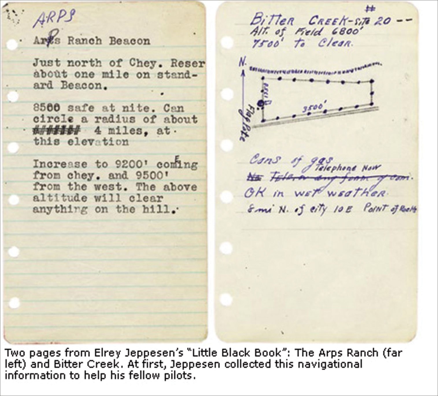
In 1930, Elrey Jeppesen flew air mail between Salt Lake City and Cheyenne, Wyoming, using road maps, terrain, dead reckoning and IFR—I Follow Railroads. He began drawing airfield charts “to preserve myself for old age and to help fellow pilots.” The descendants of his “Little Black Book” are still doing that today.
Fred Simonds is a Gold Seal CFII and factory-certified G1000 instructor. See his web page at www.fredonflying.com.


