
Back in the old days of aviation weather, surface and upper-air charts were complicated things left to the forecasters. As a pilot, you made a phone call and copied down takeoff and destination weather, the flight weather conditions, and any hazards along the way. Today’s pilots are more sophisticated, well versed in electronic devices, and likely interested in the cutting edge of technology.
As we move into this new decade, let’s look at the surface chart that plots METAR observations in graphical format and learn how to use the information. The NOAA Aviation Weather Center (AWC) website (www.aviationweather. gov) offers a slick weather map interface under the “Observations, METARs” menu. This lets you view the same maps used by operational forecasters. The map interface is easy to use, and in seconds you can see an informationpacked display of weather along your route.
The surface chart is comprised of hundreds of station plots—graphical pictograms of information representing much of the information given in the METAR observation. It’s a highly standardized form developed over 100 years ago and is easy to understand once you learn the elements.
Temperature
The most familiar number on station plots is the temperature, which always appears at the plot’s top left. Maps from outside the United States will be in Celsius. Upper-level charts are always in Celsius. When using a map from a new source, scan the margins to look at the range of temperatures. Values from -10 to +80 degrees, are a giveaway that temperatures are in Fahrenheit.
Get in the habit of skimming temperatures across the entire chart and looking for unusually warm or cold areas. This often indicates the presence of a front. By locating the thermal gradient and placing the front on the warm side, you will have located it exactly. This also works for thunderstorm outflow and sea breezes.
Dewpoint
The dewpoint is at the bottom left of the station plot in the same units as temperature. The value is proportional to the absolute quantity of moisture in a given volume of air. This value will always be relatively high in tropical regions, between 60 and 80 degrees F, and much lower in polar regions.
We can use this as a tracer to guess where the air mass came from. Regions of similar dewpoint typically come from the same general area. That’s not true of temperature, which is affected by daily sunlight swings, elevation, and adiabatic heating and cooling. Regardless of whether the atmosphere is warmed by the sun or cooled by radiation, air will always maintain its dewpoint temperature unless moisture has been removed or added.
During the summertime, dewpoint is strongly correlated to areas where thunderstorms will occur. There is no set value at which this happens because it depends on the air mass, its stability, and the weather patterns. But if upper-level conditions across a forecast area are the same, those with the highest dewpoint are most likely to produce storms. This is because dewpoint is the most significant contributor to high equivalent potential temperature (theta-e) that dictates how buoyant the parcels feeding a storm updraft are. Buoyancy is also strongly correlated with storm severity.
Typically, dew points in the 60s and 70s in springtime and fall are strongly associated with severe weather (50s in mountainous regions). During the summer, this rule rarely holds since the upper atmosphere is filled with warm air, reducing instability.
Another essential item is dewpoint depression, which can be obtained by looking at the numerical difference between the temperature and dewpoint and is proportional to relative humidity. Values of less than five-degrees Fahrenheit are strongly associated with a relative humidity of above 80 percent and favor the development of clouds and fog. If the dewpoint depression is zero, the air mass is saturated, and fog or precipitation is almost certain.
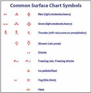
Weather
Weather symbols often grab your attention. Drawn on the station’s left side, they show the type of weather or obscuration to visibility at the station. The sample map on the previous page shows numerous plots with fog due to upslope flow of cool, humid air.
A short list of the most common weather symbols is shown to the right. A full list is available from the Internet using the keyword “present weather symbol.”
Visibility And Ceiling
Visibility is always paired with the weather symbol. It’s given in statute miles, but plots from overseas locations will show four-digit visibility in meters. It provides a quick look at how bad things are at each site. If good weather, with unrestricted visibility, no value is plotted.
The ceiling is rarely plotted on weather maps, but AWC knows how vital the data is to pilots, so it’s on the right of the station plot in hundreds of feet. The ceiling is the base of the lowest cloud layer covering over half of the sky. If the sky is obscured by precipitation or phenomena like smoke or dust, the number seen here represents vertical visibility.
Pressure
A weather map can show either sea level pressure or altimeter setting. They’re slightly different expressions. Most weather maps on the Internet show sea level pressure in millibars, plotting only the tens, units, and tenths digits. But AWC knows that pilots use these charts, so altimeter settings are in inches, using the units, tenths, and hundredths digits. Put the decimal between the first and second number and prefix either a “2” or a “3” to get the value as close to 30.00 as possible.
Scan the map along your flight route and observe the pressure values to see if there are locations where pressure dips sharply before rising again on the other side. These dips are pressure troughs. These often mark a wind shift and sometimes coincide with fronts.
On the map, drawing a line along Interstate 40 from Albuquerque (KABQ) to Oklahoma City (KOKC), we find a pressure trough in eastern New Mexico near Santa Rosa (KSXU). This indeed marks a strong cold front just east of the station.
Sometimes a trough is just a trough. But if different air masses are around, frontal formation is favored here due to the convergence of the wind field that amplifies temperature contrasts. Troughs also favor showers and thunderstorms if there’s enough moisture.
Identifier
All weather stations are referred to with an identifier. This grew out of the early 20th-century practice of disseminating reports via teletype and identifying each location with short three-letter identifiers. When a four-letter identifier appears here, it indicates an International Civil Aviation Organization (ICAO) location indicator and signifies a METAR report. For example, KDFW shows the Dallas- Fort Worth airport.
A five-digit identifier indicates a World Meteorological Organization (WMO) identifier—that plot is constructed from SYNOP data, a heavily coded format used worldwide. For example, 72421 indicates the WMO identifier for Cincinnati. The AWC plots do not use SYNOP data.
Wind
Wind data is plotted using a shaft and feathers that always point into the wind. If the shaft is pointing northwest, the wind is between 300 and 330 degrees. This means you’ll probably be landing on Runway 32 instead of 14. These winds are always transmitted in the METAR reports referencing true north, so they’re plotted on the map as-is without any conversion.
If there’s no shaft, you’ll see a circle around the plot, and winds are calm or light (two knots or less). If the circle is not present the wind information is missing or unavailable. That means there could be possible wind conditions at that location. A missing shaft does not mean calm winds!
A shaft has lines on them called feathers. Each full feather represents 10 knots, and each half-feather means five knots. Add them up to get the wind. A triangular pennant is rare but means add 50 knots.
When there are wind gusts, an extra feather is plotted in red. Count the black ones to get the sustained wind speed and include both black and red to get the wind gust. If there are two full black feathers and one full red feather, the winds are 20 gusting to 30 knots.
Other weather sites, such as UCAR’s at weather.rap.ucar.edu, use a different system of representing gusts. It is plotted next to the station plot, prefixed with a “G.” Read the number to get the gust. Some sources omit gust information, so refer to the actual METAR report. Sky condition The center of the station plot circle is filled to represent how much cloud cover based on how many oktas (eighths) of sky cover there are. In the METAR system, we don’t use oktas, but a single vertical stripe for FEW, a quarter pie shape for SCT, three-quarters pie for BKN, and complete filling for OVC.
An “M” in the center of the plot indicates sky condition is unavailable. This means the weather agency was too cheap to install a ceilometer or hire an observer—or the equipment is broken. Refer to nearby stations or satellite data to fill in the information. If you’re lucky, there will be a TAF for the location, which is even better.
In the worst conditions, an “X” in the center means the sky is obscured by weather phenomena. In that case, the ceiling represents vertical visibility. This often occurs during torrential rains, blowing snow, dust, and heavy fog.
Finally, there’s color-coding. Green on Aviation Weather Center maps indicates VFR conditions. Blue is marginal VFR (MVFR), which in the U.S. means the ceiling is between 1000 to 3000 feet or visibility is three to five miles. Red indicates IFR—ceilings under 1000 or visibility is less than three miles. Pink is the worst category: LIFR (low IFR) meaning ceilings 500 feet or below, or visibility of one mile or less.
A Few Tips
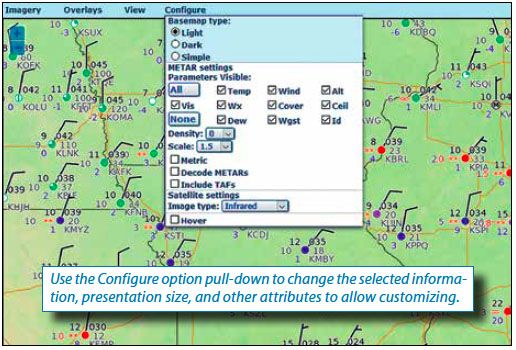
You can pan and zoom by dragging the map and using the mouse wheel and the plus (+) and minus (-) buttons. Click on station plots to see the METAR. You can change this to a decoded form or add the TAF with the Configure Panel options. A slider at the top of the map lets you view data for up to 24 hours in the past, and an expand button lets you pop out the map to fill the whole screen.
The Configure Panel has dozens of options for customizing the map’s appearance. One of my favorite options is Density that adds more observations to the map or reduces the clutter. I prefer lots, so I don’t miss any important features. Another option is Scale—enlarging the plots if your vision isn’t so good or reducing it to increase the Density. Selecting Hover, you can place the mouse over any station to see the METAR report.
The Aviation Weather Center surface map is another useful tool to have at your disposal while planning your next flight


Good article. However IMHO the user interface at AWC is so 20th century… much prefer Windy.com.
Great stuff. I always find this chart informational and it becomes more intuitive the more I use it. Lastly, the HEMS tool on the AWC site is very similar with a bit more information available if needed.