
In a pinch, you may only have access to one type of chart, and it might not be the type you’re familiar with. A good briefing is essential for every departure and approach, and a good knowledge base for the chart type in use will help facilitate that briefing. Let’s compare AeroNav and Jeppesen approach charts.
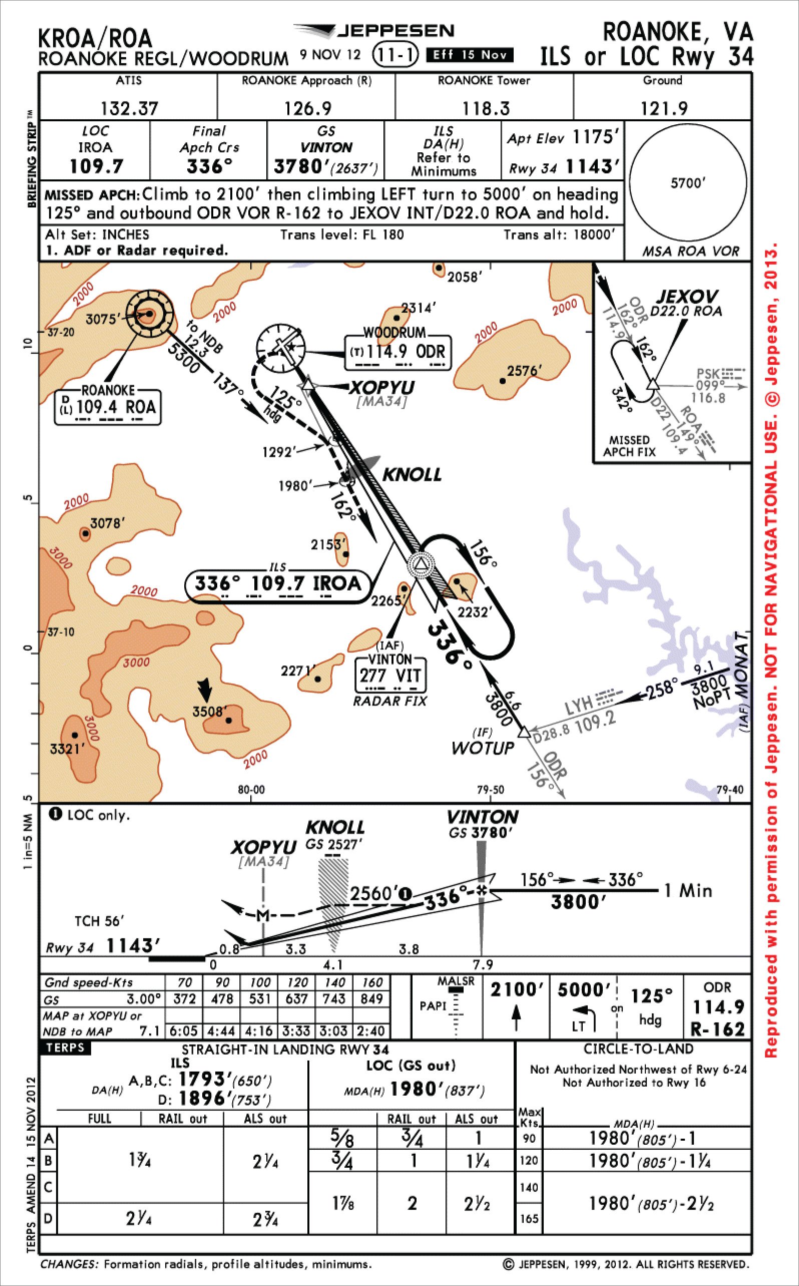
Let’s use the ILS or LOC Rwy 34 in Roanoke, Virginia for comparison.
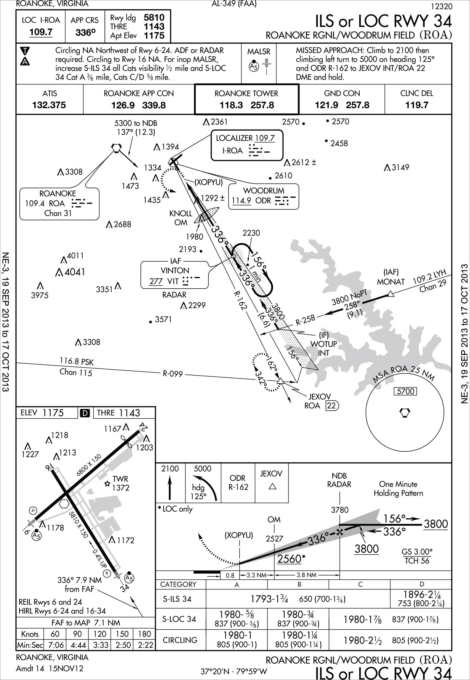
Jeppesen puts the procedure name along the top margin for convenience in a binder. AeroNav charts also have the information on the bottom for the “flip book” Terminal Procedures Publication (TPP). AeroNav indexes the charts by the municipality served by the airport, not the airport name. Many a Jepp user has gotten lost trying to find Martha’s Vineyard Airport under “M” in the TPP, when it’s actually under “V”, for the town of Vineyard Haven.
Briefing
In September 1997, Jeppesen began condensing essential briefing information—frequencies, key altitudes, missed approach instructions—in a convenient series of boxes near the top of the chart, with the trademarked name, “Briefing Strip.” (Notice the fine print in the left margin.)
During the following decade, NOS (then NACO, now AeroNav) also began to similarly condense the summary information. Each supplier provides somewhat different information.
Jeppesen shows the altitude on glideslope at the nonprecision FAF. AeroNav provides UHF frequencies for military users. AeroNav puts the approach light diagram at the top while Jepp puts it with the graphical missed approach. Jepp puts the MSA circle at the top, while AeroNav finds a place for it in the plan view.
AeroNav highlights non-standard takeoff minimums and/or an obstacle departure procedure for the airport with a , and non-standard alternate
minimums with an , referring you to sections L and M of the TPP, respectively. At certain airports, Jeppesen’s “10-9” page (named for its index #) is an airport diagram that shows the alternate and departure information on the back side. If a 10-9 hasn’t been created, the airport diagram and alternate/departure minimums are located on the reverse side of the first approach chart.
The notes on the Jeppesen chart are the last line of the Briefing Strip, while AeroNav puts them between the alternate minimums symbols and the lighting diagram. AeroNav needs a lot more information here because Jepp puts circling restrictions and inoperative component information down with the minimums section.
Plan View
AeroNav’s plan view is somewhat bigger than Jepp’s, which is accentuated by Jepp using a somewhat closer view. Note the location of the IF WOTUP on the localizer. It’s much closer to the edge on the Jepp chart, necessitating the depiction of the missed approach holding fix, JEXOV, in an inset.
Jepp uses a black arrow to point to the highest obstacle (3508 feet, south of the LOC frequency box), while AeroNav uses a larger font for the highest obstacle. In this case, AeroNav’s broader view finds an obstruction at 4041 feet MSL that is out of view on the Jepp chart.
The Jepp chart repeats the final approach course inside the localizer frequency box. Look at the ROA VORTAC frequency box. Jepp notes the VOR class (in this case, “L”) and indicates it has DME with the “D.” AeroNav lists the channel number for the TACAN, which is also your indication of DME.
Profile View
In the profile view, one of the biggest, though subtle, differences is the depiction of the ILS final approach fix. Remember, this is not the Maltese cross, which represents the FAF for the nonprecision (localizer, here) approach, but is the lowest published ILS intercept altitude at glideslope intercept. AeroNav depicts this by repeating the altitude with a lightning bolt pointer to the glideslope intercept, while Jepp merely relies on the pilot knowing it’s the prominently depicted intermediate segment altitude of 3800 feet, here.
Jeppesen uses a dashed line to depict the nonprecision approach profile, showing a minimum altitude of 2560 until KNOLL and then a slight descent to the MDA at XOPYU. AeroNav shows the minimum altitude at KNOLL right next to the fix, which they simply label as the “OM.” Jepp includes the database waypoint “MA34” (missed approach fix for Runway 34), under the label for XOPYU, with which it is collocated, and clearly indicates the localizer MAP with an “M.” Jepp provides the threshold crossing height (56 feet) and repeats the threshold elevation (1143) at the runway depiction, and puts the glideslope angle in the speed/time table. AeroNav has separate text, here to the bottom-right on the profile, showing the angle and TCH.
Minimums
In the minimums section, Jepp aligns the various approaches (ILS, LOC, Circle) in columns with the minimums underneath in rows by aircraft approach category. AeroNav chose the opposite route—approach type in rows and category in columns. AeroNav includes some ceiling and visibility information in parentheses for military operators.
In the graphical missed approach instructions, AeroNav includes the intercept heading in the same block with the altitude and turn instructions, while Jepp puts the intercept heading in a separate block.
The biggest difference on the chart is that AeroNav includes an airport diagram inset. Not to be confused with the more detailed airport diagram page they provide for larger airports, the sketch can be a handy tool for planning post-rollout actions. Jepp’s tradeoff of always putting the airport diagram on a separate page allows a lot more information on the airport diagram page, and on the approach chart has a little more room to spread out their minimums section.
Much has been made of AeroNav’s switch to THRE for threshold elevation from TDZE (Touchdown Zone Elevation). They left the definition out of everything except the legend on the TPP itself. To compound the confusion, they even left a sample chart with TDZE in the latest Aeronautical Chart Users Guide. Jeppesen, as in this example, labels the same elevation “Rwy 34”, which according to their legend is conveniently labeled “Touchdown Zone/Threshold Elevation” when referenced in the Briefing Strip. Checking the legend for the label in the profile view, it says it will be labeled “Touchdown zone, runway end, or threshold elevation as appropriate.”
Revisions
Each depicts the chart revision differently. Jepp prints the effective date right next to the chart index number top-center, opposite the revision date and periodically publishes a checklist showing the latest available revision date. AeroNav publishes an effective date range in the side margins of each page and the TERPS revision date on the bottom, which Jepp puts on the side. AeroNav publishes a “Change Notice” book 28 days after the TPPs are published, so users must check this publication for procedure changes halfway through the 56-day cycle.
eppesen replaces individual pages as new ones become available every 28 days, while AeroNav simply publishes new regional books of all the approaches every 56 days.
Overall, the differences between the chart types are relatively subtle, and with some occasional familiarization, the thorough instrument pilot should be able to extract the correct information from both with little difficulty. Prepare yourself to use both types and you’ll never get caught off guard.
Evan Cushing is a safety manager at a regional airline. In 15 years there, he’s served as pilot, check airman, instructor and fleet manager. He regularly uses both AeroNav and Jeppesen charts, and finds features he prefers in each.


