
You’ve probably heard someone tossing around the term “GOES satellite” at one time or another. This refers to a NOAA satellite program that has been in operation for 47 years. GOES stands for Geostationary Operational Environmental Satellite, in other words, a weather satellite that’s parked 22,236 miles (35,786 km) above the Earth’s surface, directly above the equator. At this altitude the satellite orbital speed perfectly matches the Earth’s rotation, allowing it to remain permanently above a fixed location on the planet. That gives it a constant view of the United States.
A Quick History
The very first weather satellites of the 1960s, known as TIROS, were lifted into a low Earth orbit, close to that of the altitude where the International Space Station currently operates. Since an object in low Earth orbit rotates much faster than the Earth, forecasters only got fleeting glimpses of weather at any one spot. Digital imaging did not yet exist, so the satellites carried television cameras that gave grainy images. Georeferencing was a difficult task at the time, so forecasters often didn’t quite know where the image was located.
By 1966, NASA began launching the very first geostationary satellites, starting with the ATS (Applications Technology Satellite) series. These were demonstrator platforms that gave us the first modern satellite image in December 1966. This led to the SMS (Synchronous Meteorological Satellite) in 1974, an early prototype for GOES. Finally in 1975, GOES-1 was launched.
NOAA also began operating a sophisticated satellite data processing center, which provided georeferenced images to end users showing state and country overlays. By the late 1970s, newspapers and television weathercasts were presenting these pictures every day, making them a household staple.
A total of 17 GOES satellites have entered service over the years, each bringing newer technology. The two GOES satellites currently in use are the GOES-R series, which were added in 2017 and 2019. These were a tremendous boost to forecasters, since they quadrupled the picture resolution while imaging the United States every five minutes. Previously, routine images were only available every 15 minutes. The GOES-R series is also equipped with 16 spectral bands, lightning detectors, and many other scientific sensors.
Visible and Infrared
Satellite imagery has traditionally been divided into two categories: visible and infrared. Visible imagery approximates what the eye can see. That’s great, but there’s never any visible data at night. Infrared imagery is available 24 hours a day, because the Earth, the oceans, and the clouds are always radiating (or obscuring) infrared emissions. By displaying cold temperatures as high levels of brightness, we get a sort of approximation to visible imagery, because clouds, ice, and snow are visually bright. It’s not the same, but it does the job.
Part of properly using satellite imagery is knowing when you’re looking at visible (VIS) or infrared (IR) imagery, because the principles for interpreting the pictures are different. If you’re on a meteorology website, that’s easy because you usually have to choose which one you want to see. Even aviationweather.gov allows you to choose between visible and infrared. It gets more problematic with flight weather products and television graphics, because satellite pictures often become generic resources with little explanation.
A quick rule of thumb is if it’s cranking out images 24 hours a day, it’s an IR image. Since this is convenient for flight weather services, most of the time they build their products around IR images. Another test that works in summertime is to look for areas where fair-weather cumulus clouds are known to exist, either from looking out the window or from checking METAR reports. If the imagery shows them vividly, it’s VIS imagery. If the imagery doesn’t show them or shows dark gray smudgy textures, that’s IR, because summer cumulus clouds are relatively warm and blend in with the ground.
Infrared imagery has gotten a little more complicated with the arrival of the GOES-R satellites. These provide two visible channels and 14 infrared channels. While it’s fun to look around at each of them, the only one you need to be concerned with is the clean long-wave IR or the regular long wave IR channels. This will give you traditional infrared imagery. You probably don’t need to use any of the others, although I regularly use the water vapor channel.
Visible Images
Visible imagery is my favorite product, because it provides an intuitive view of the weather, as you’re looking down on it from space. It’s surprisingly neglected by many weather websites and is rarely shown on TV weather, but to me it’s absolutely vital when forecasting storms because you can see so much of what’s going on. Haze, dust, boundaries, small cloud formations, and all kinds of little clues show up easily. We don’t see those things very well on infrared images. If you’re flying during the day, bookmark a favorite source for close-up visible images of your area and give it a quick check before heading out to the plane. I think you’ll find the information quite useful and easy to understand.
With visible imagery, brightness corresponds to albedo, the diffuse reflection of solar radiation. The highest albedo, and the brightest pixels, are caused by fresh snow. Next, cumulus clouds reflect 70 to 80 percent of the sunlight back to space. At the low end are water bodies and forests, which reflect only about one tenth of the sunlight. These will always appear dark.
Fog and stratus, one of the big hazards for aviation, shows up as bright white on visible imagery. This contrasts with infrared imagery where it’s dull gray or even blends with the ground. This is yet another reason to use visible imagery whenever possible.
Because fog and stratus are bright white, they can sometimes be confused with snow. Here is where it’s important to use animation of the imagery. The textures and borders of snow will not move at all. Cloud forms, however, will show some movement. And if you’re still not sure, checking the METAR reports will sort things out for you.
Can we differentiate fog from stratus? This is not always possible because the cloud base
height can only differ a few hundred feet between the two. I tend to see fog and stratus as part of a spectrum of low cloud. At many points on this spectrum they behave like the same thing.
But at the far ends, we can find some differences. Classic radiation fog tends to closely follow the terrain, and you can pick out the smallest valleys and hollows like fine tendrils ringing the edge of the cloud form. Stratus conforms to the terrain a bit less, and the edges might show rapid movement with the winds at 1000 or 2000 feet AGL. Advection fog tends to spread and will do the same thing, but pure radiation fog like that found in places like Bakersfield and Boise doesn’t move much, and grows and shrinks gradually like a sponge swelling and contracting. Ultimately whether it’s fog or stratus boils down to what the METAR observations are showing.
Visible imagery is also great for looking at thunderstorms. Overshooting tops are readily seen, appearing as a cluster of bumps about 5 or 10 miles wide embedded in the middle of a storm’s anvil cloud. These correspond to the area of intense updrafts and some of the most dangerous vertical velocities, and are closely correlated to areas of hail production. Mushy, light gray overshooting tops indicate a weak updraft, while a high contrast overshoot with shadowing suggests a strong updraft that’s especially dangerous. While this shouldn’t be used for navigating your way through storms, it does give you some idea of what kind of storms you’re dealing with.
The days of ugly grayscale visible images are over. GOES-R only detects red and blue, like what you’d see wearing a pair of old 3-D glasses, but there’s enough data coming off the satellite where weather websites can construct a fairly accurate “true-color” approximation. I personally use these true-color images all the time as they’re pleasing to the eye. For example, the College of DuPage site listed below provides them in their “RGB Color Products” under “True-Color” (alternating temporarily to grayscale infrared at night).
Infrared Imagery
Visible imagery might be my favorite, but there’s excellent information to be found in infrared imagery. Brightness is inversely correlated to temperature. That’s right—you’re looking at a heat map in reverse. The brightest infrared objects include thunderstorm anvil clouds, the dense cirriform clouds in frontal weather systems, and in winter, the Polar Regions. The darkest objects are deserts and warm water bodies like the Gulf of Mexico.
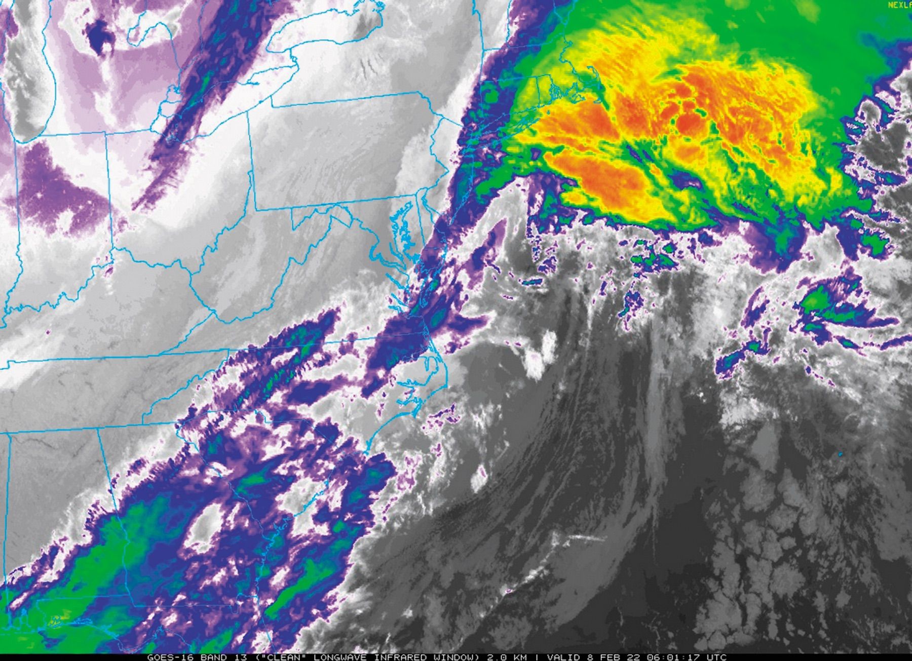
It’s common for the colder parts of the brightness scale to be converted to bands of colors. This is called infrared enhancement. Since precipitation is often, but not always, associated with cold cloud tops, this gives a sort of pseudo-radar presentation. A classic case of where this is done is in media portrayals of hurricanes, where the thicker parts of the storm appear in formidable shades of green, red, and yellow.
It’s important to understand that you’re not looking at radar data but strictly at a map of cold cloud temperatures. With hurricanes and thunderstorms, this makes the rain area appear much larger than it really is. Likewise in dense mountain-wave cirrus, like that found in places like Denver during the cold season, enhancement schemes portray many shades of red, green, and yellow, but these clouds generally don’t produce precipitation.
Where you can be fairly certain of rain is where you see spherical, bubble-like spots of very cold or highly enhanced cloud with strong contrast. These are usually cold tops from convective towers, and heavy precipitation is likely. Conversely, featureless, broad smudges of infrared enhancement are probably just stratified layers of cloud. Either it’s dry there or light-to-moderate, steady precipitation is falling.
It’s possible to view satellite imagery overlaying actual radar data instead of an infrared enhancement, but this is rare and I’m not aware of any sources on the Internet. The National Weather Service certainly has the capability on their workstations. A quick rule of thumb is if you look a few hundred miles from any coastline and see color bands in the clouds, that’s probably infrared enhancement, because there are no radar networks to be found on the high seas. Sorry, Captain Jack Sparrow.
Multispectral Imagery
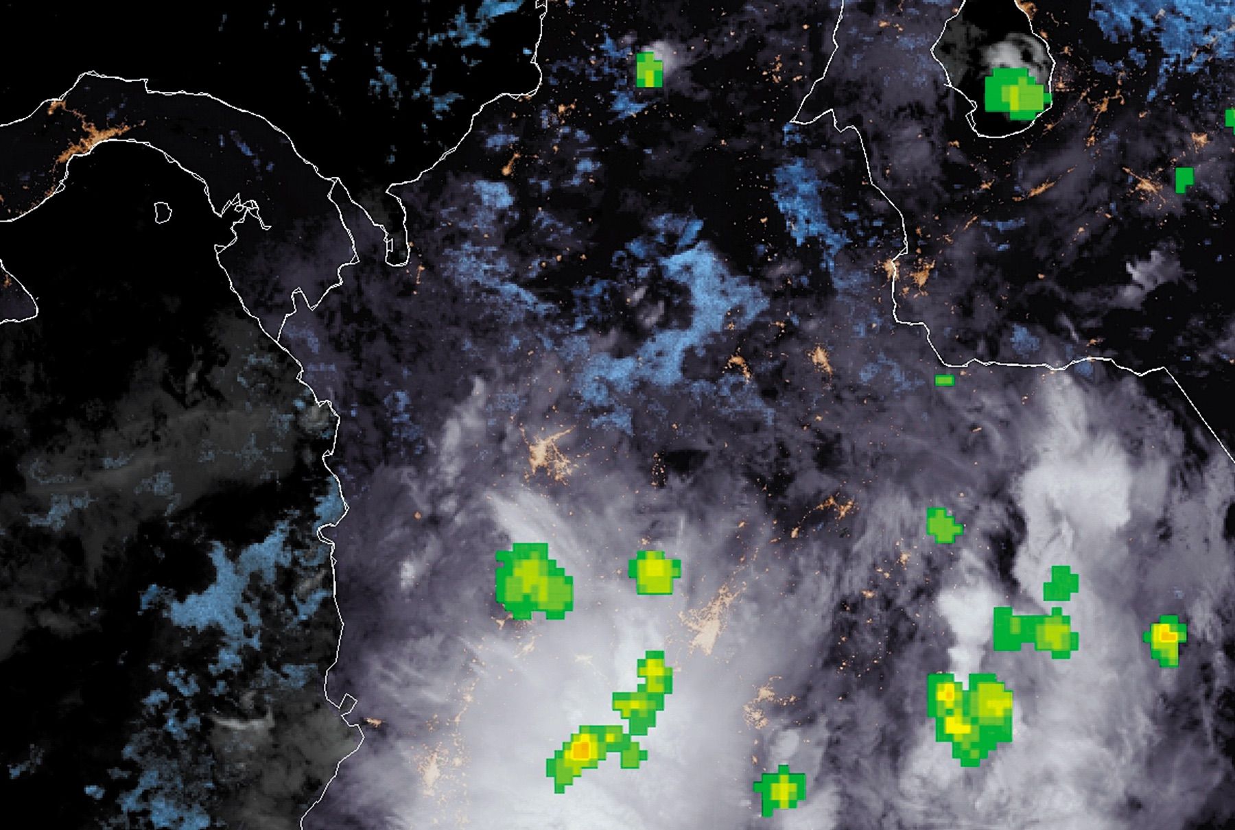
Multispectral infrared imagery might sound like some arcane art better suited for scientists with slide rules than for an IFR-rated pilot, but I should reiterate that the technology from GOES-R is groundbreaking and pilots should explore how it can help them. I’ve seen some amazing examples, especially at night when fog starts popping up, and thought to myself that an EMS helicopter pilot flying at night should want to be looking at this stuff.
Though it might sound complicated, multispectral imagery is just cleverly taking various infrared channels and adding or subtracting them from one another. This exploits various characteristics in the chemistry of the atmosphere, where various forms and phases of matter emit or absorb radiation in certain narrow bands.
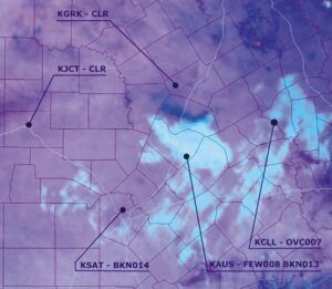
The multispectral product that’s most useful for pilots is called the nighttime (NT) microphysics product. When visible imagery ceases at the end of the day, this is a great product to use because it sees everything. It not only detects fog and stratus, but it has some skill at discriminating between the two, and distinguishing them from higher layers like stratocumulus.
Look for small, localized patches of bluish or aqua-colored clouds that suddenly appear. These are classic indicators of fog and low stratus on NT microphysics imagery. With cloud tops that are above 1000 to 2000 feet AGL, the aqua becomes whiter in color. Higher clouds are reddish and can generally be ignored. Satellite animation should also be used to differentiate cloud type.
The NT microphysics product cannot be used during the day since solar radiation overwhelms the algorithm. Another problem is shallow fog (less than 50-75 feet deep) blends with the terrain and is hard to identify. Furthermore the colors will shift in cold weather or over unusual terrain. So it’s best to practice using the product and get accustomed to it for your area, comparing it with METAR observations, and in a short while it will become second nature.
A Few More Tips
The new GOES-R satellite carries the GLM (Geostationary Lightning Mapper) which detects lightning strikes. This doesn’t just cover the United States but includes most of North and South America and the adjacent oceans. It’s definitely something you’ll want to check if your flights take you to the Caribbean or Latin America.
To find this satellite data, check your favorite flight-planning resource to see what they offer. But also check out some of the good satellite viewing sites. One of my favorites is College of DuPage’s viewer at weather.cod.edu/satrad. The images here are often less than 5 minutes old. The official GOES viewer at www.star.nesdis.noaa.gov/GOES is also a good pick, and has better coverage over Latin America and the oceans.
Tim Vasquez was an Air Force meteorologist and part of his recipe for success has been getting the best satellite images possible. He now resides near Dallas writing weather books and software.


